Want to know what's hot in the world of web design? Here are the most important web design trends 2022 that you should definitely know. Enjoy!
Some companies go for a traditional style. Others want to stay up to date in terms of design. No matter which group you belong to and for whom you design your websites - it never hurts to know which trends in web design are currently in demand.
In recent years, a good user experience has been one of the web design trends par excellence. And a focus on a better UX should and can always be integrated - no matter what branding strategy your customers follow.
Headers - Big videos & strong typography
Cinema Style Videos
Videos as full-screen headers are in vogue. With new, more web-friendly formats (such as WebM), large-scale videos can be implemented without extending loading times. Particular about cinema style video is, whoever visits your website not only sees an appealing video, but is immediately involved in the action. 11coffee achieved this very well.
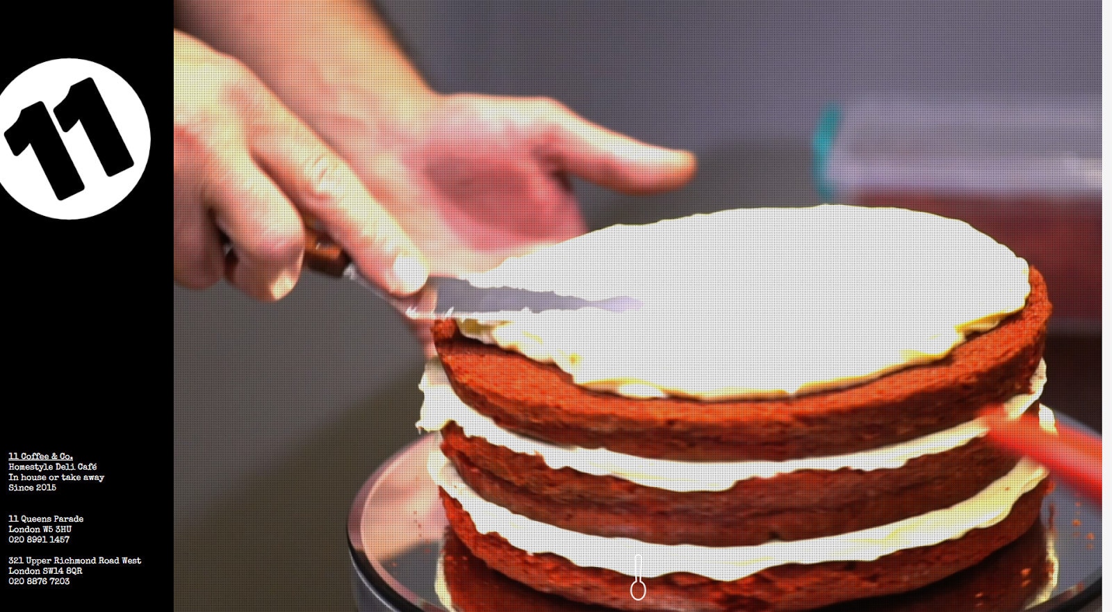
Watching the video makes you feel as if you are sitting in a café. You immediately get a sense of its hustle and bustle. And you also get an idea of the products that are offered on site. You form a personal connection to the employees and the brand before you even get to know them.
The special feature of this style is that visitors to your website are integrated from the start. This helps to reduce the distance between website and visitor, or product and customer. In addition, you minimize the use of text on your website.
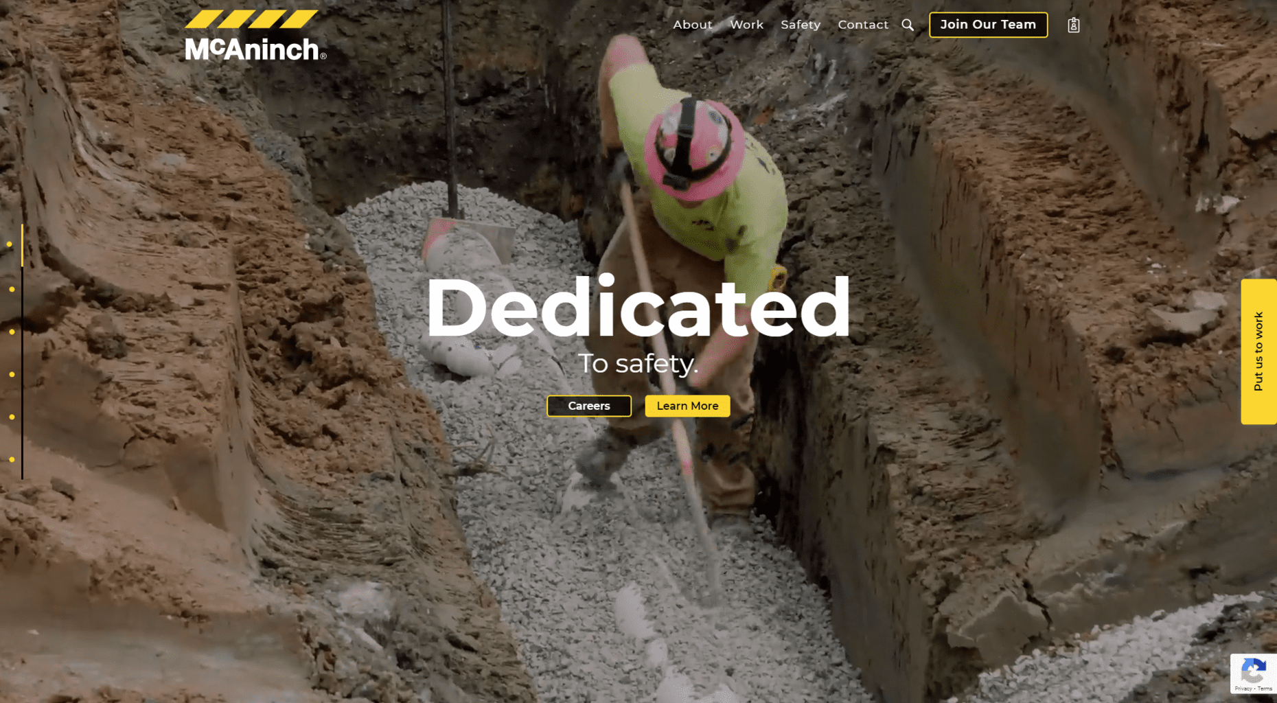
A video used in such an important place must be provided with a fallback image. By doing so, visitors won't be greeted by a screen-filling error message in the event of a poor internet connection, but at least see the fallback image.
Oversized typography
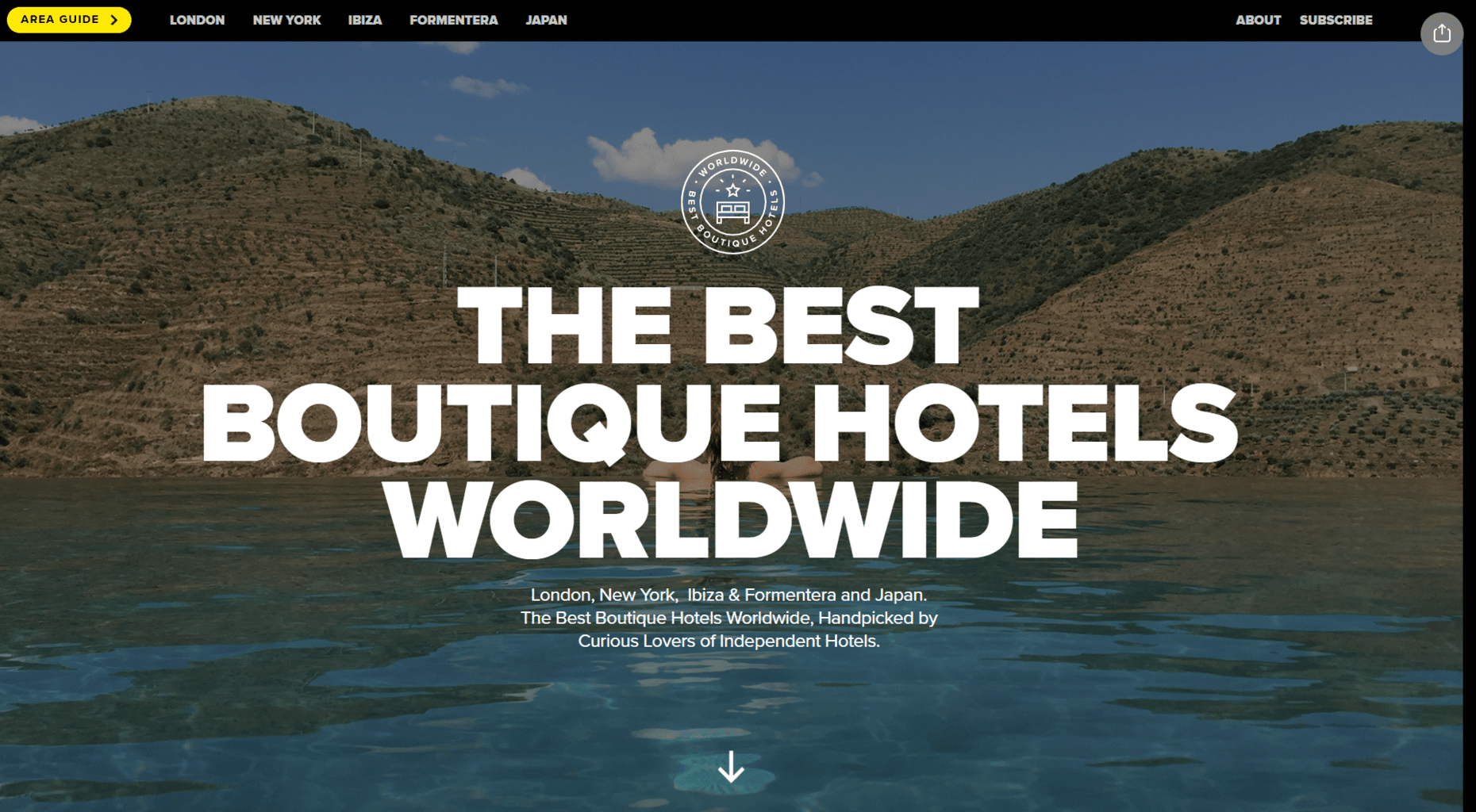
This approach offers the opposite to the full-screen mode. Oversized fonts can be supported by visuals as slogans, such as Best Boutique Hotels Worldwide.
Web fonts can also be found as the sole visual element in the header of your website. In the example of Onomatet, the typo does not function as a headline, but as a navigation element.
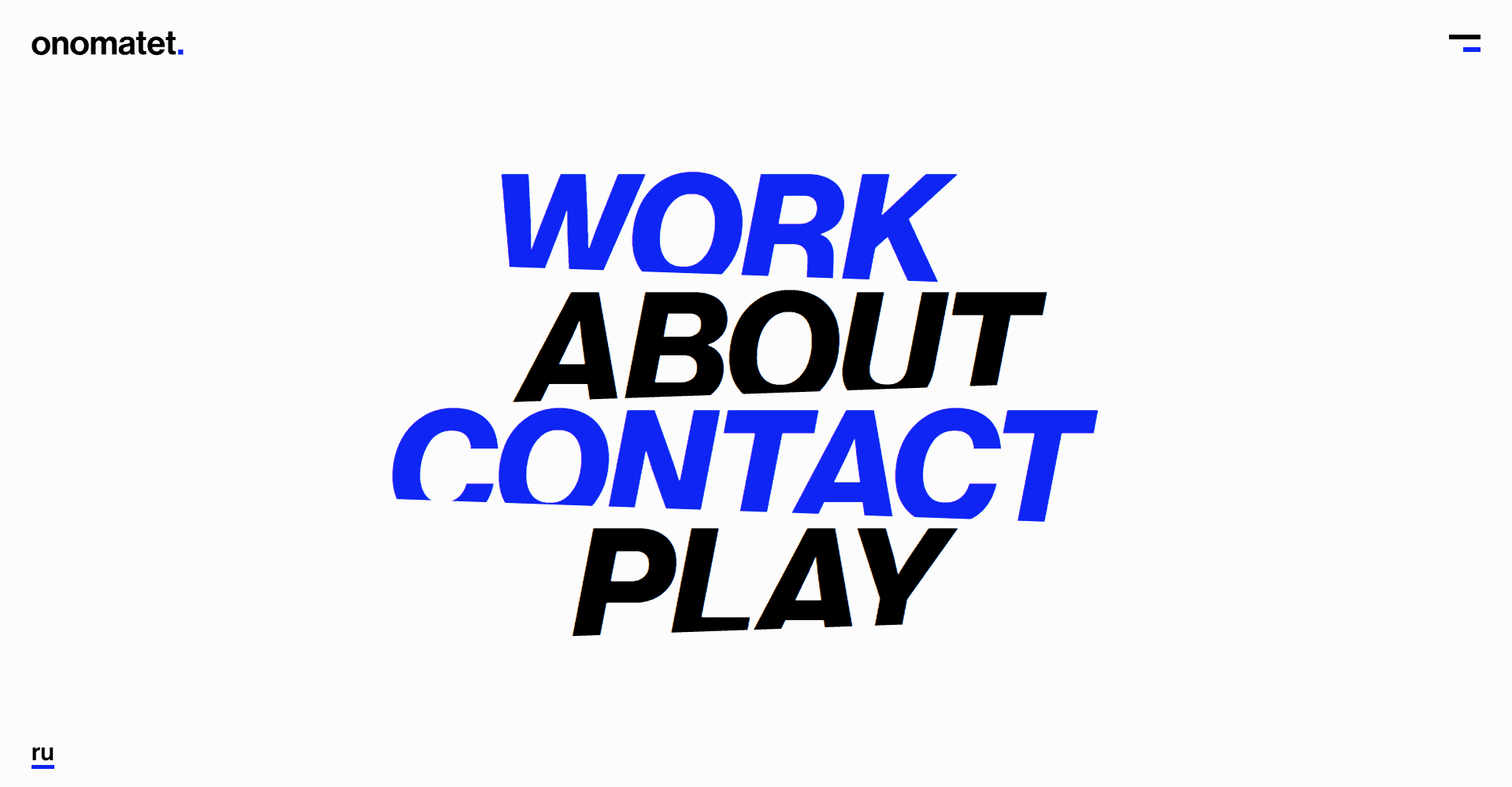
This style can be very minimalist under certain circumstances. In this example, it concentrates on the essentials and prevents visitors from being overwhelmed by stimuli.
Let's compare this with the video header from before. Through the video, closeness and personality are built up. We develop positive emotions toward the product and the employees. With the help of minimalist use of typography, a cool distance is created. And at the same time a kind of elegance. The design generally feels more pragmatic.
Layout & visual elements in web design
Diagonal lines
Lines have long been a popular visual element in web design. With the use of diagonal lines you can make your design more interesting. Diagonal lines are more "open" than horizontal lines. This is because diagonal lines connect content instead of separating it.
Thereby, they help enormously to navigate through your content. With the help of diagonal lines, you create a visual path for your target group, leading them to the relevant areas of your website.
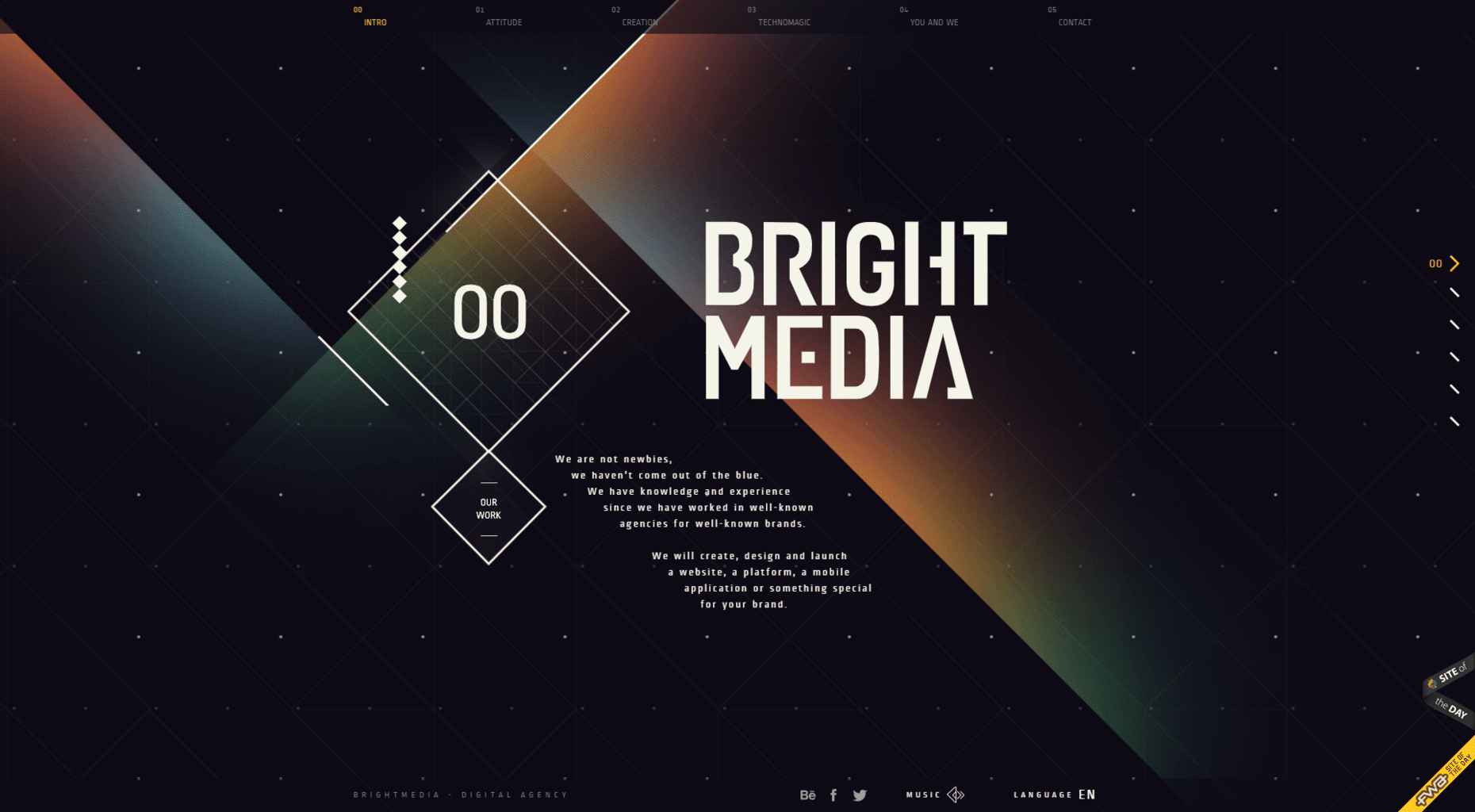
I find the diagonal lines on the Brightmedia website to be very successful.
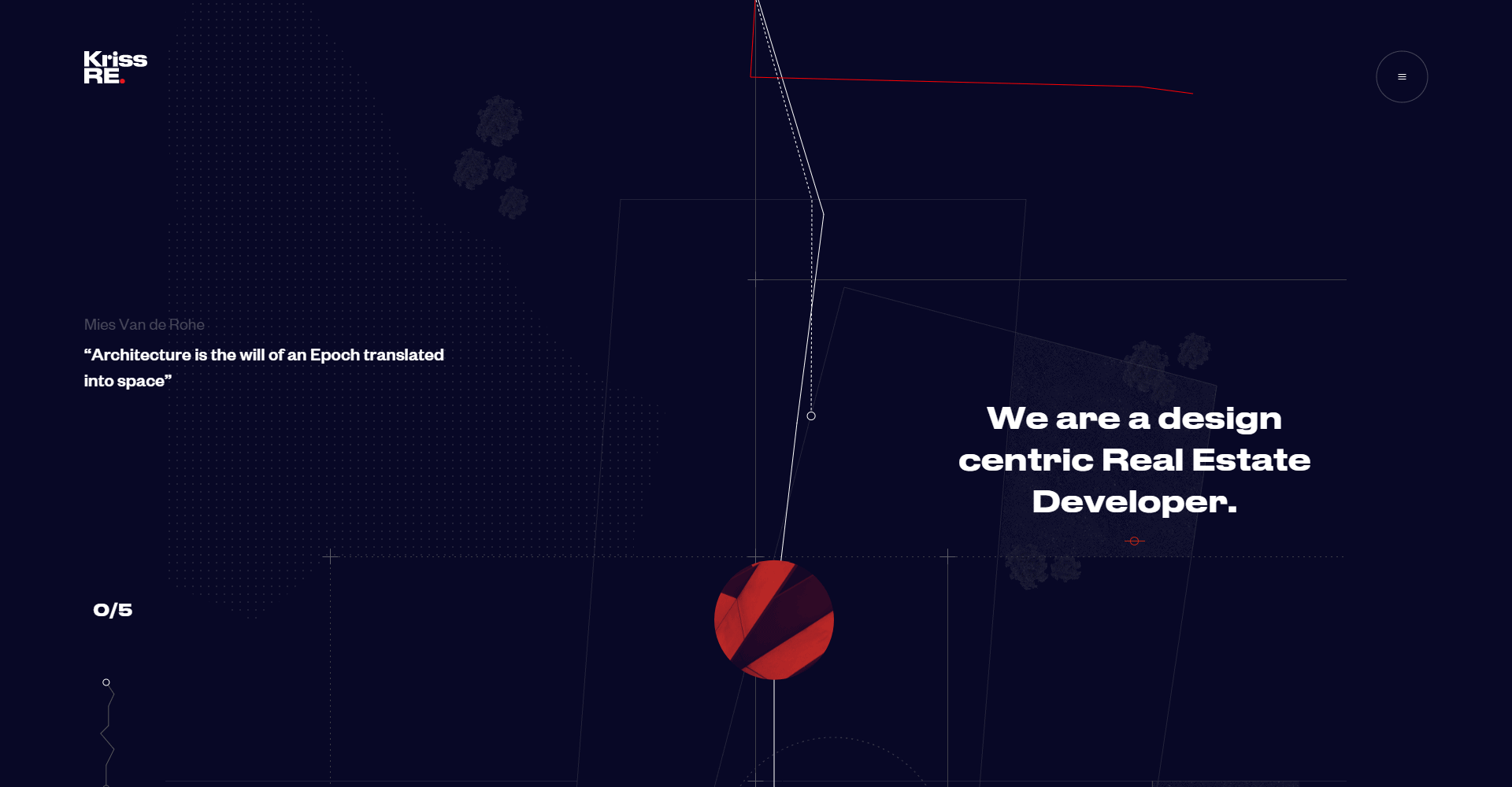
Kris Real Estate has what I consider to be a somewhat jerky approach. Visually, I find the red line that the mouse pointer leaves behind interesting. However, it distracts from the important content - and an added value is not (yet) apparent to me.
Scrollable text elements
Scroll effects can be integrated nicely with oversized headlines. There are many different approaches here.
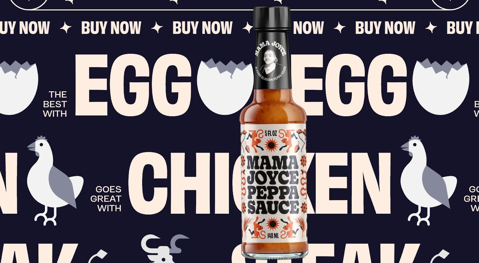
Peppasauce's website consists almost entirely of large typo that moves as you scroll. This gives the otherwise rather static feel of the website a sense of mobility.
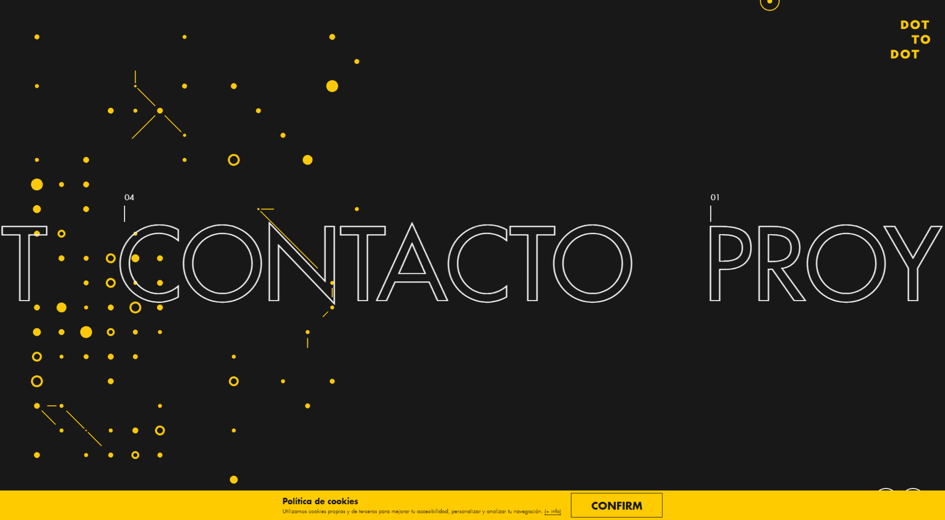
With Dot To Dot we see a menu that scrolls horizontally.
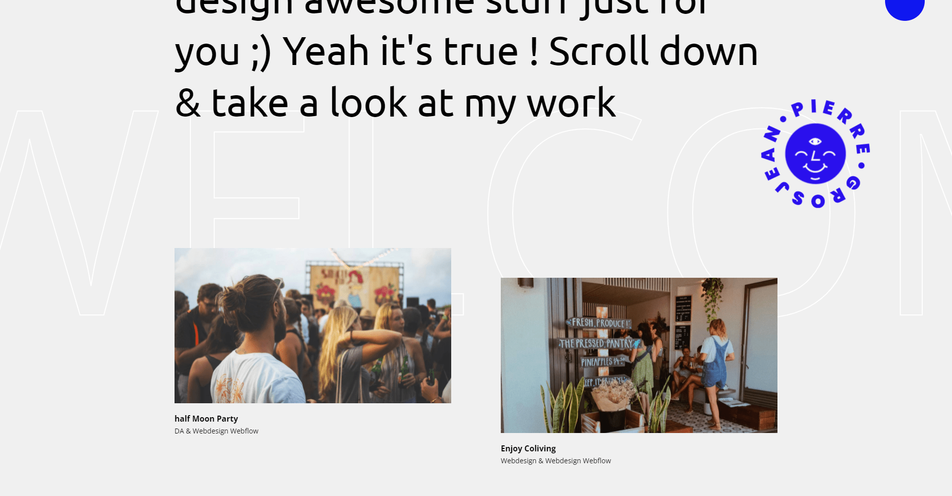
Unlike the two predecessors, Pierre Grosjean uses scrollable text as a background element. This allows you to give your website more dynamism without visually overloading your visitors.
Shadows and floating elements
Flat design has persisted and still finds its place in web design today. Flat Design later evolved into Flat Design 2.0, where flat graphics are given more depth through the use of shadows.
This style will continue to accompany us in the future. By using different types of shadows, you can also give your 2D design the impression of different layers. This way you can pull important elements into the foreground. This can be combined well with floating objects.
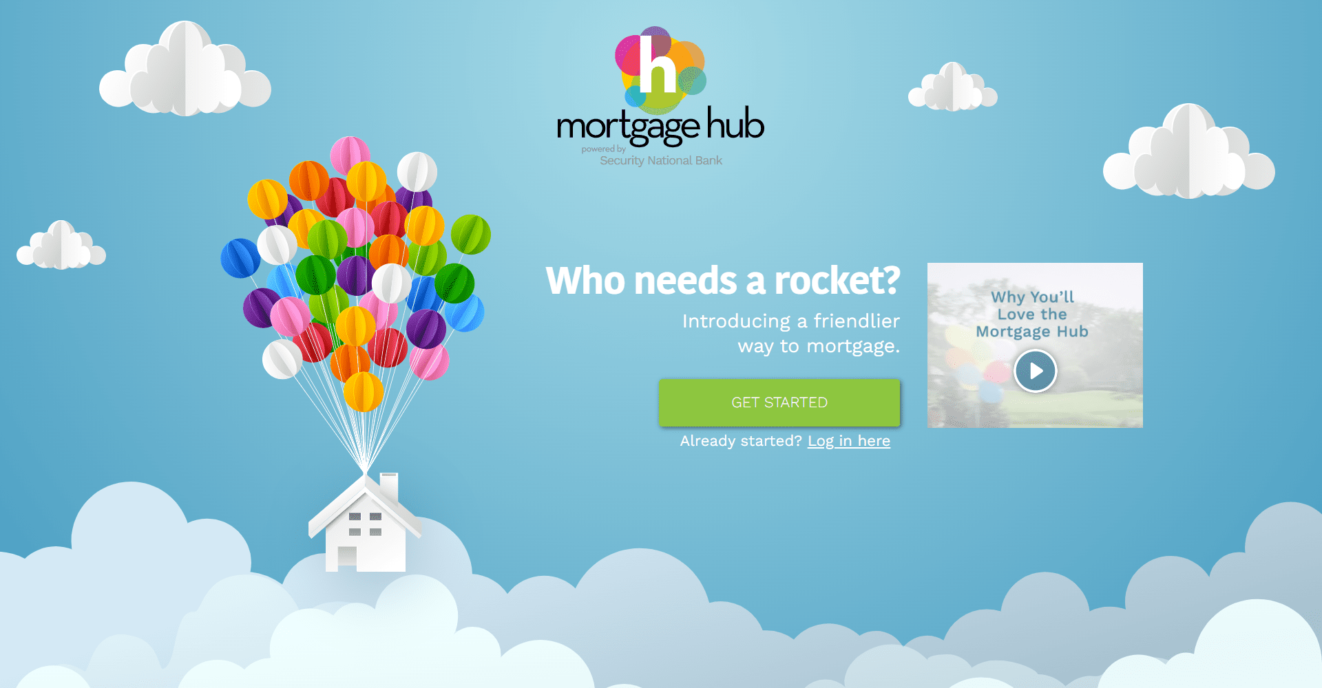
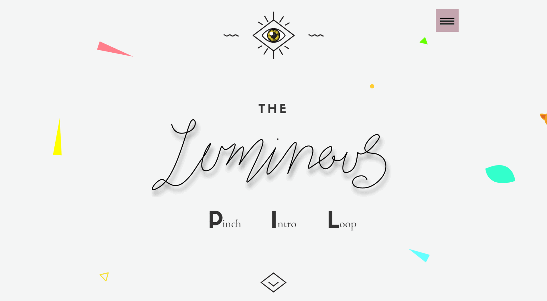
This allows you to create the depth of 3D spaces through the arrangement and use of 2D elements. Two good examples of this are My Mortgage Hub and Luminous.
"*" indicates required fields
Elements that overlap
We saw in the previous section how to create depth with different layers and shadows. Another way to play with 2D design is to superimpose elements.
Under certain circumstances, you can override the physical properties of your elements. Background elements could then lie in front of a foreground element. This effect can be intentional, but it can also lead to confusion.
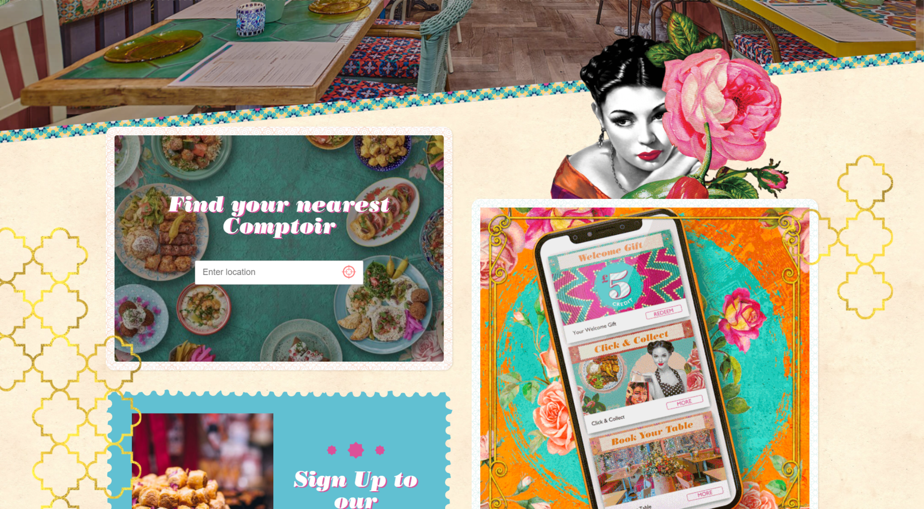
We find a well-sorted approach at The Stylist Group.

When overlapping objects, you should make sure that none of your content is lost and that all texts remain legible. You can implement this style wonderfully with the help of CSS Grid.
Interactive web elements
Another way to bridge the distance between visitors and website operators is the use of interactive elements.
This does not need to be elaborate. The first question would be - What offers add value to your target group? Offer a questionnaire to adapt your product to the preferences of your target group.
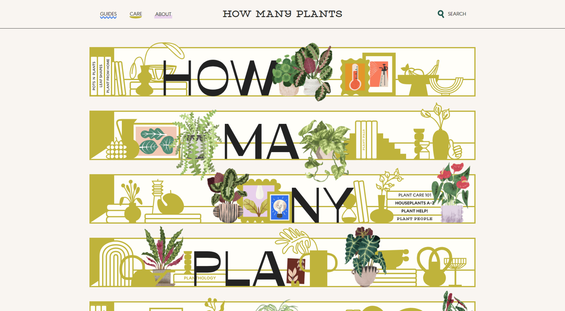
However, interactive elements can also be humorous and offer no direct added value, as on the How Many Plants website, where the mouse pointer turns into a watering can and you can hover over the plants.
Clear and prominent call to action
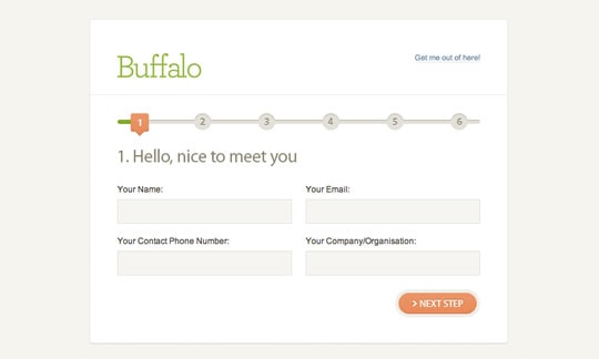
Here is another web design trend that addresses the user experience. Calls to action should be clear and prominent. Buttons also remain rather large and bulky, so that we can reach them on mobile devices without problems.
Progressive forms
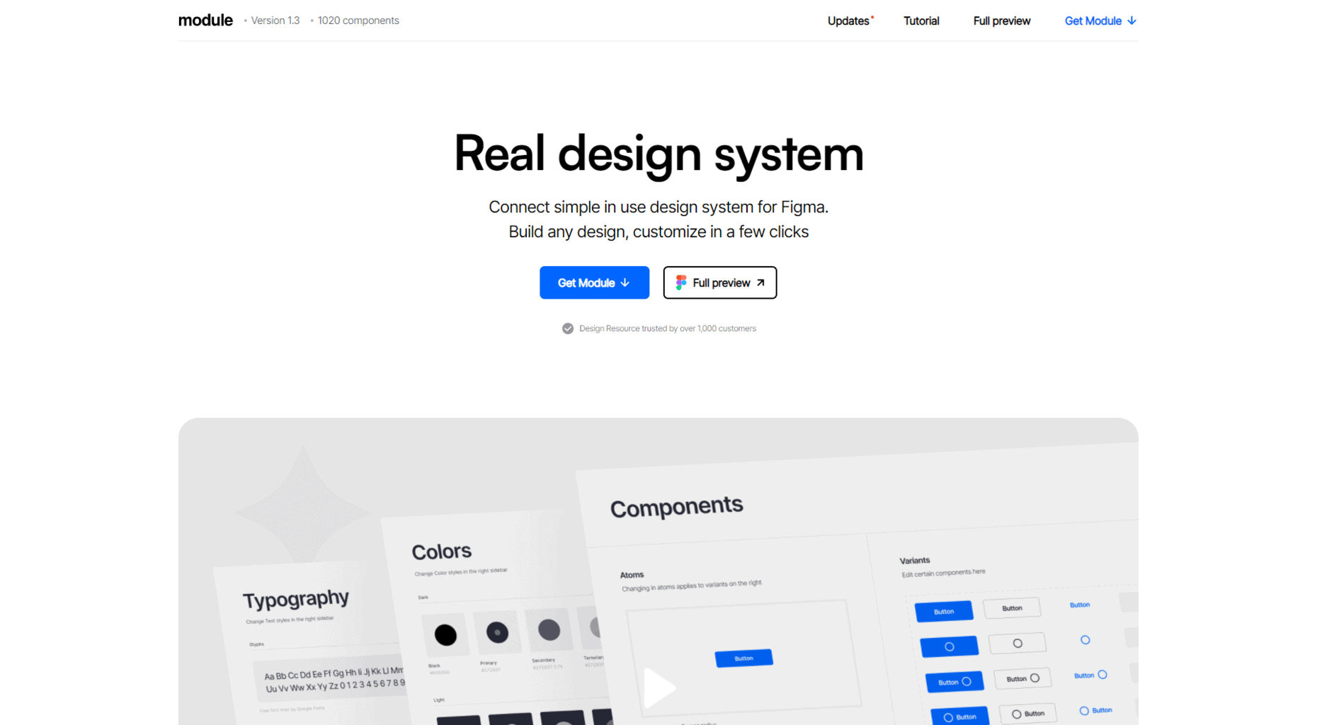
This web design trend also serves the user experience. Progressive forms are those that have been divided into several, clear steps. They ensure that your users do not immediately give up when they see larger forms.
Once some information has been entered, visitors will experience it more difficult to leave the progress made than to complete the form.
Conception & strategies for your website
Show donʼt tell
A principle that I have known for a long time in the field of creative writing will also have an impact on web design in the future. With the "show don't tell" principle, you make your brand or product understandable through the structure and use of visual elements. Instead of juggling a lot of words, you let your target group know what you offer and who is behind it through the look and feel. If you do this successfully, you will eliminate the need for a lot of text and your website will become more manageable and innovative.
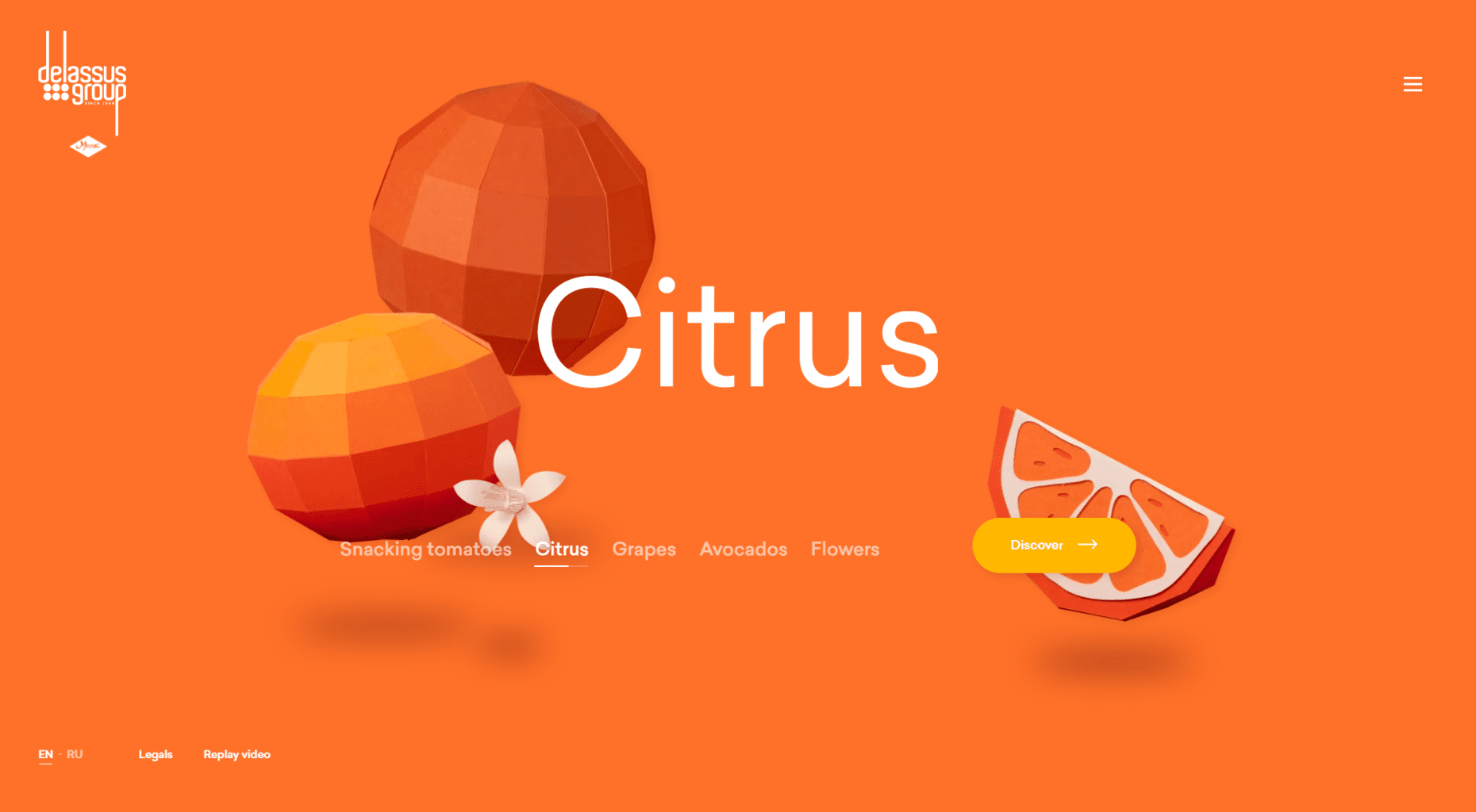
We often follow this concept with scrollytelling. Here we tell stories that unfold pictorially and in words - similar to a digital journey through the website.
The use of full-screen videos supports the visual representation of your brand. You tell a story about your brand or your product without using words.
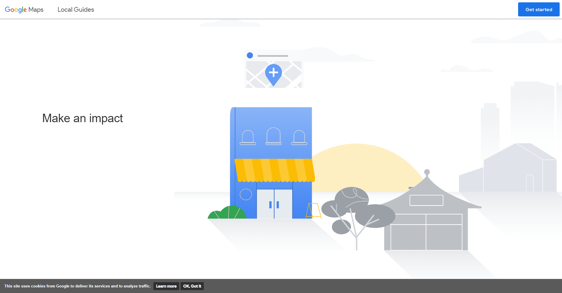
Google has developed an appealing website to explain and attract local guides. It underlines each step with an animation and explains in a comprehensible way which actions are possible.
Positive design with a humorous twist
After two years of worrying news, we are looking for a balance. Web design is becoming more humorous and easy to digest. Even supposedly serious companies can now focus on positive design.
Small surprises make us smile during our journey through the web. Luminous, for example, gives us a visit from a shy cat peeking out from the right edge of the screen.

Local SEO
If your brand has a physical shop, stick to keywords and content that are environment-related. This way you will be found and listed in a search for "service XY near me".
Local SEO has been around for a long time. In the beginning, however, it was mainly used on the desktop. Nowadays, it also plays a major role for mobile devices. The Local SEO Guide offers you a comprehensive insight.
More web design trends 2022
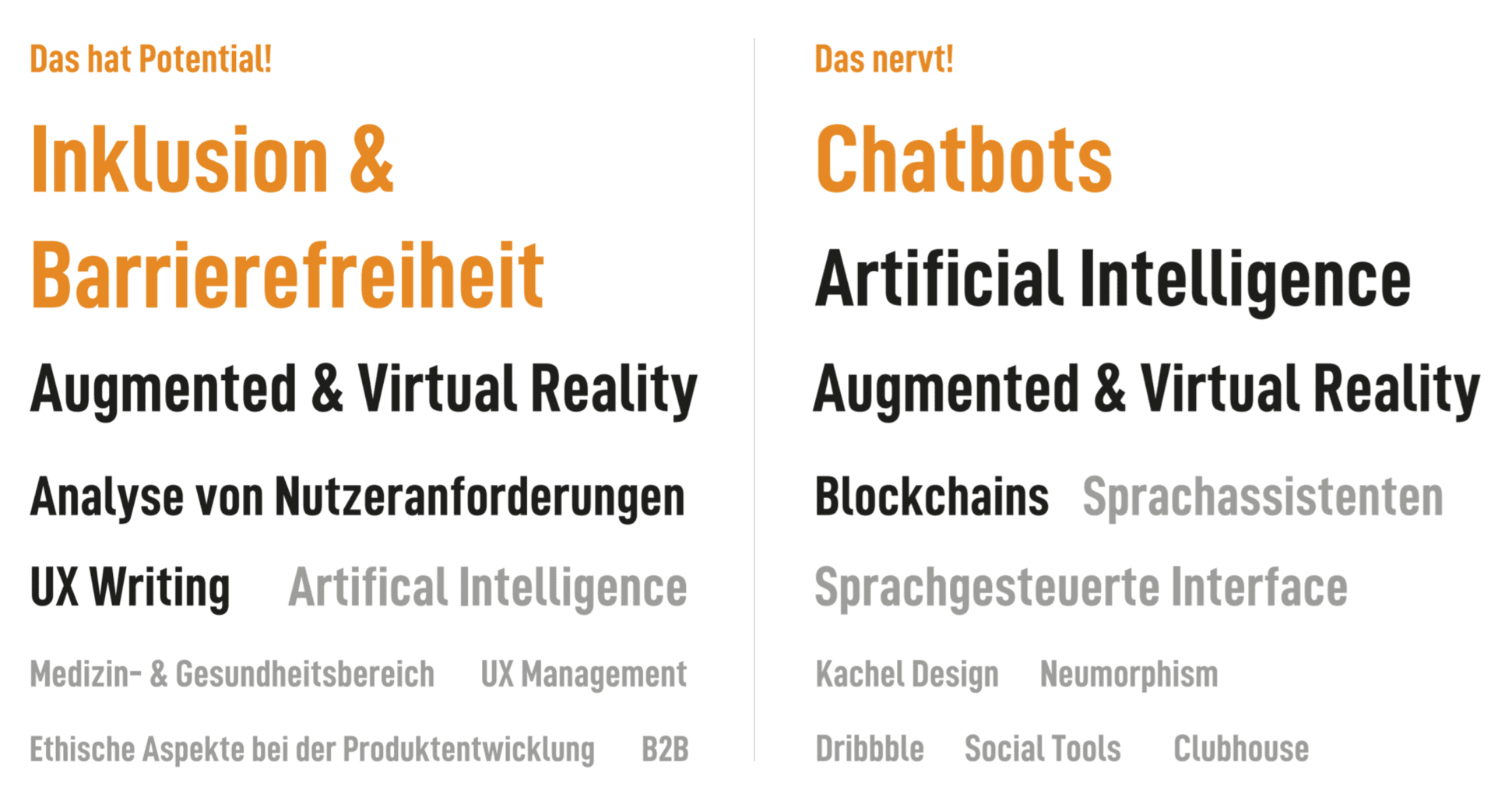
According to a survey by GermanUpa, chatbots, artificial intelligence and AR/VR are at the top of the list of most annoying trends. Especially with new technologies, you should always consider who you are designing the website for. Depending on your target group, it may be worthwhile to forego some trends in web design.
Old but Gold - Trends that stay
What we will continue to see in 2022:
- Personalized contents
- Light and Dark Mode
- Minimalism
- Accessibility
- User-centred design
- Page Speed optimization
- Micro Interactions
- Mega Footers
Your questions about the web design trends 2022
What questions do you have about the web design trends 2022? Feel free to use the comment function. You want to be informed about new articles on WordPress and web design? Then follow us on Twitter, Facebook, LinkedIn or via our newsletter.
