Flexbox should be familiar to all of us by now and has already provided many developers with a quiet night or two. But what if you could expand your Flexbox layout not only vertically but also horizontally? Since the integration of CSS Grid, exactly that – and more – has been possible.
Imagine if there were a way to freely design your website in a 2-dimensional grid. By creating text blocks that partially overlay images, for example. Or even more complex image galleries without negative margin or positioning. Or, with the help of CSS, being able to quickly design page templates that are also responsive. There is a solution for all this: CSS Grid.
What is CSS Grid?
Similar to Flexbox, CSS Grid is also integrated with the help of a container element and CSS grid items. For example, we also find some properties for positioning the Flexbox: align-items, justify items, justify self and align-self. These help you position the contents of your grid accordingly.
Roughly speaking, CSS Grid is a flexbox that works 2-dimensionally:

While with Flexbox we can only build rows and corresponding columns horizontally, CSS Grid allows us to arrange them vertically as well:
At first glance, CSS Grid may seem relatively unspectacular. After all, you can achieve the same result with rows and columns.
What makes CSS Grid so special?
With the new grid system, you can build all conceivable combinations. The only condition is that they must be rectangular. You can't, for example, construct pure L-shapes.
This way you can plan and build your entire page layout based on CSS Grid. Nested grids are just as possible as the combination of CSS Grid and Flexbox.
Through clever planning, you can now also program your layouts in such a way that you can almost do without media queries – that is, if you want to. I'll go into the various possibilities in more detail later.
CSS Grid also comes with a number of other new CSS tricks that will make your life easier in the future. One of them is the new CSS unit: the so-called fraction (fr). This works similarly to the division of the size of the Flexbox items.
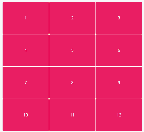
A fraction (1fr) is a part of an entire row. So if you divide your grid into 3×4, as in the example below from CSS Tricks, then 1fr = ¼ or 25%.
Another special feature also emerges here: Not all boxes have to be filled with content. You can also assign empty content in the CSS Grid:
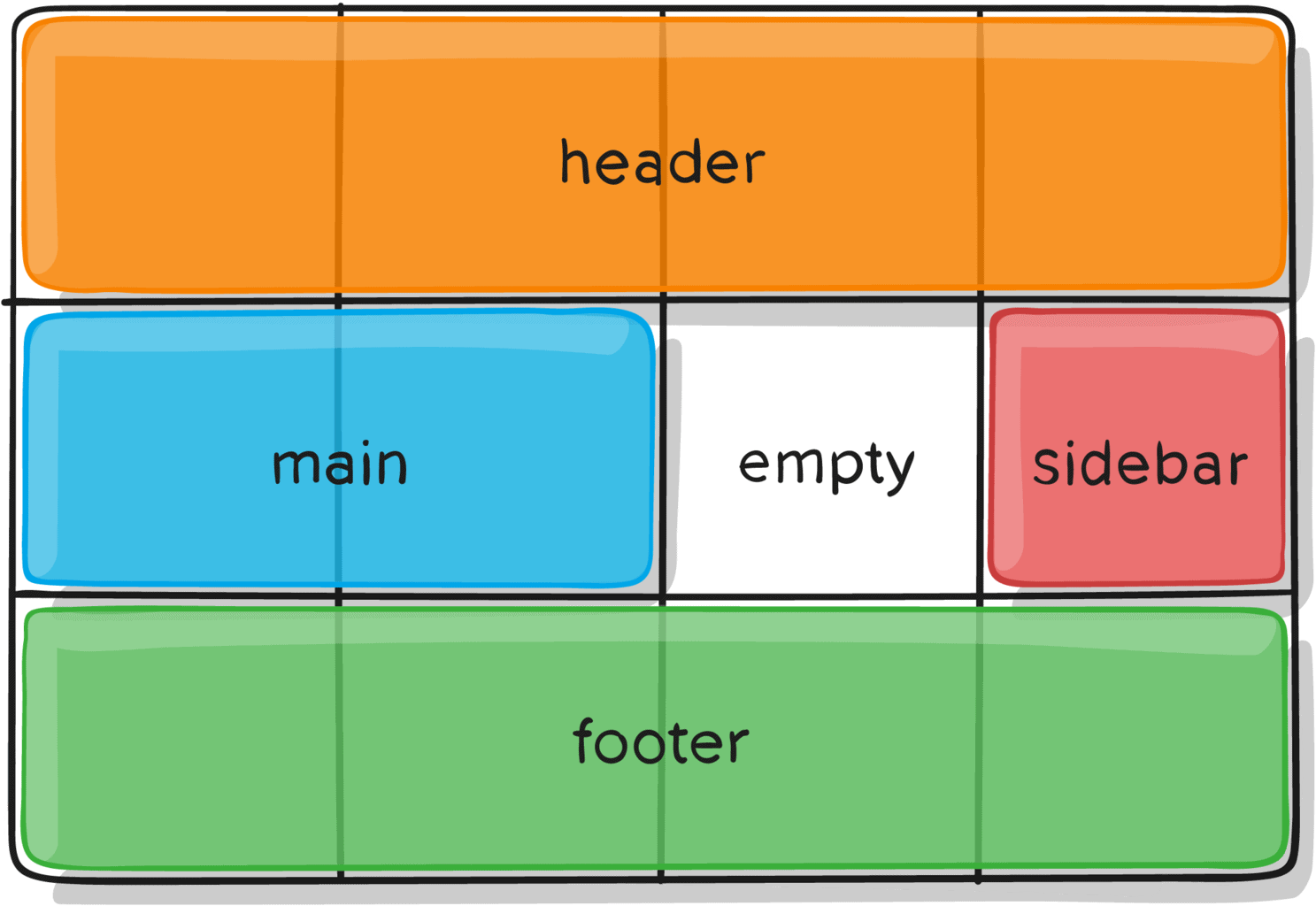
W3Schools shows other possible layouts CSS Grids are suitable for. This way we can easily determine that certain elements should spread horizontally and vertically over a certain number of boxes. Boxes can be different widths (columns) and heights (rows).
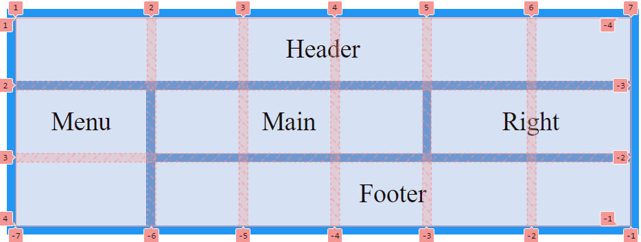
In the example above, the first column takes up more width in percentage terms than the others. This is because the width was not predefined in the CSS and is therefore automatically oriented to the content. The same would happen if we created more content than we predefined in the CSS. In that case, the grid would automatically enlarge and attach the new content.
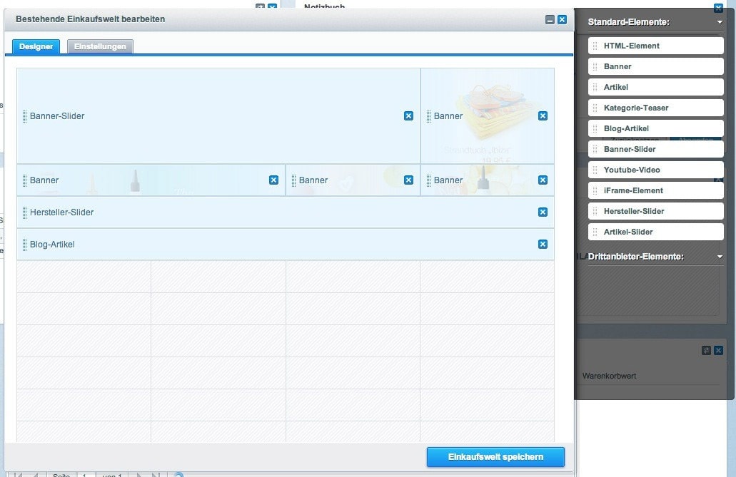
The German-language Einkaufswelten (Shopping Worlds) from Shopware is based on a CSS Grid-like system – in the backend view at any rate. In their WYSIWYG editor, content can be displayed in a grid that looks very similar to the CSS Grid at first glance. On the fully compiled site, however, no CSS Grid is used, at least by default.
Since 2017, CSS Grid has been supported by almost all common browsers. Only the Internet Explorer versions from 10 onwards still need the prefix ms- to be able to display the CSS Grid almost completely. Microsoft Edge, on the other hand, already has full integration. Now nothing stands in the way of using CSS Grid in your future projects:

What does CSS Grid look like in practice?
As already indicated, we use the basic function in a similar way to the Flexbox. First, we determine a container to which we assign the grid functions.
.container {
		display: grid;}
There are many other values you can assign to build the grid according to your wishes:
grid-template-columns, grid-template-rows and grid-template-areas (collectively, these can also all be set with grid-template). These properties contain information about the number and size of the rows and columns. You can also define the distances between them with the properties column-gap and row-gap (or gap for short).
You also have the option – similar to Flexbox – to determine the overall positioning within the grid. You can use the following properties to this end: justify-items, align-items (short: place-items), justify-content, align-content (short: place-content).
With the grid-auto-flow property you can also determine in which direction your grid should flow with the values row, column or dense. While row and column take care of the horizontal and vertical alignment, respectively, dense determines that your grid is filled economically. That is, this value may change the arrangement of your elements within the grid to fill otherwise empty space. This is an interesting feature especially for image galleries. This way, in different screen sizes, elements will move up if necessary and there will be no visual gaps.
While you define the columns and rows in the container and the distances between them, you use the grid items to determine exactly where they should be located in the grid.
A finished grid could then look like this on the CSS side:
.container {
		display: grid;
grid-template-columns: 40px 1fr 1fr 1fr 40px;
grid-template-rows: 25% 100px auto;
gap: .5rem .8rem
justify-items: stretch;}
Now you've created your grid container, it's time to fill it with the grid items. The special thing about the CSS grid system is that the arrangement in the HTML can be secondary because you can give each item a start and end coordinate. This is done with grid-column-start, grid-column-end, grid-row-start, grid-row-end.
The coordinates point to the grid lines and count from left to right, or from top to bottom. These can also be abbreviated as grid-column and grid-row.
Advanced users can also use grid-area to give these fields all the coordinates at once. Or you can assign a name to your grid item, the placement of which you can then determine yourself in the grid container. But it's not only the grid items you can name. It's also possible to assign names to the grid lines so that you can tell the grid items their coordinates using these names. This saves you having to count through the grid.
It's also possible to use negative values, or counting numbers from left to right or bottom to top. However, these options are more interesting for advanced users of the CSS Grid. You can read more detailed documentation here:
Last but not least, you can also individually determine the positioning of the contents within the grid items. This is done with the properties: justify-self and align-self (in short: place-self).
A grid item in CSS could look like this:
.item-a {
		grid-column-start: 1;
  		grid-column-end: span 4;
  		grid-row-start: 2;
  		grid-row-end: span 2;
align-self: center;}
Grid row-end and grid-column-end can also be used with "span +n". Here you save yourself tedious line counting. "Span 2" tells the item that it should extend over two grid fields. Detailed explanations of the individual properties can be found in the guide from CSS Tricks.
"*" indicates required fields
Examples from the web
If you're a visual type like me, you probably need to see some real-life examples to fully understand the CSS Grid. I've therefore rummaged around a bit on the internet to find sites that have either been created with CSS Grid, or which could benefit from its use.
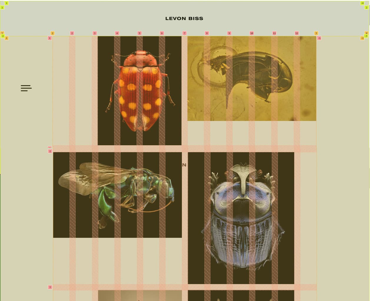
Levon Biss used the CSS Grid as an implementation tool to create his portfolio. If you take a closer look at his site with the examination tool, you'll notice that the site was built with nested grid systems. First, the site was divided into three sections: header, main and footer. The height for the header and the footer was predefined, while the main part can flexibly grow with the content with the value "auto". The columns were set to the entire available width with 1fr.
.page-wrap {
   height: 100%;
   display: grid;
   grid-template-columns: 1fr;
   grid-template-rows: 96px auto 72px;
}
The main of his site was again packed into a grid system. Notice how the CSS units px and fr were mixed here. This way, the border has a fixed width of 144px each, while the middle part remains flexible.
.gallery-wrap{
   display: grid;
   grid-template-columns: 144px 1fr 144px;
   grid-template-rows: 1fr;
   height: 100%;
}
Lastly, the gallery was also nested once more. Previously, no values were given for the grid gaps. For the gallery, these have now been set to 1em. This saves adding margin between the images. So you can set the gaps once in the document.
.grid {
   display: grid;
   grid-template-columns: repeat(12,1fr);
   grid-gap: 1em;
}
Another special feature of CSS Grid is the repeat() function. This is a shortened notation of repeating values.
Repeat() takes the set of values to be created as the first value and the size as the second value. Written out, this would look like this:
.grid {
   grid-template-columns: 1fr 1fr 1fr 1fr 1fr 1fr 1fr 1fr 1fr 1fr 1fr 1fr;
}

In this example, no CSS grid was used. As in the previous example, we could have either nested the grid or added a margin to the grid container for the outer spacing.
This is what the grid division could look like:
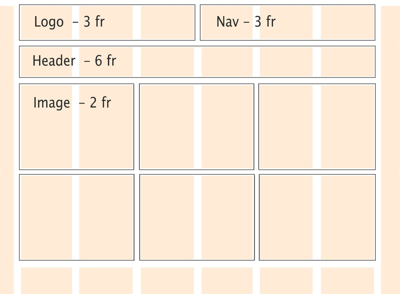
A possible approach to CSS may look like this:
.container {
  margin: 0.5em 3em;
  display: grid;
  grid-template-columns: repeat(6, 1fr);
  grid-template-rows: 100px 80px auto;
	gap: .5rem;
}

.logo {
  grid-area: 1 / 1 / 2 / span 3;
  justify-self: start;
}
.nav {
  grid-area: 1 / 4 / 2 / span 3;
  justify-self: end;
}
.header {
  grid-area: 2 / 1 / 3 / span 6;
  justify-self: center;
}
.logo,
.nav,
.header {
  	align-self: center;
}
.img {
  grid-column: span 2;
  grid-row: span 2;
}
.img img {
  width: 100%;
  height: 100%;
  object-fit: cover;
}

Although the entire Larq website could have benefited from the CSS grid, I only selected a small area for illustration purposes. It is precisely here that the advantage of a 2-dimensional grid becomes obvious.
This is what the distribution of the grid items could look like:

A possible approach to CSS may look like this:
.container {
  margin: 0.5em 5em;
  display: grid;
  grid-template-columns: repeat(3, 1fr) 50px repeat(3, 1fr);
  grid-template-rows: 3rem 20px 100px 100px;
  gap: 1rem;
}

.heading {
  grid-column-start: 1;
  grid-column-end: 8;
  grid-row-start: 2;
  grid-row-end: 1;
  justify-self: center;
}
.img-a {
  grid-area: 3 / 1 / span 2 / span 1;
}
.img-b {
  grid-area: 3 / 2 / span 1 / span 1;
}
.img-c {
  grid-area: 4 / 2 / span 1 / span 1;
}
.textblock {
  grid-area: -3 / -4 / span 2 / span 2;
  align-self: center;
}
Combine CSS Grid and WordPress
With the new WordPress editor, content can now also be displayed in rows and columns by default. However, the layout reminds me more of Bootstrap and co. and I miss the two-dimensionality a bit. That's probably what others thought as well and the reason the plugin Grids: Layout builder for WordPress. was developed. The plugin is free of charge and does exactly what it promises: it allows you to visually create CSS Grids without having to use a page builder.
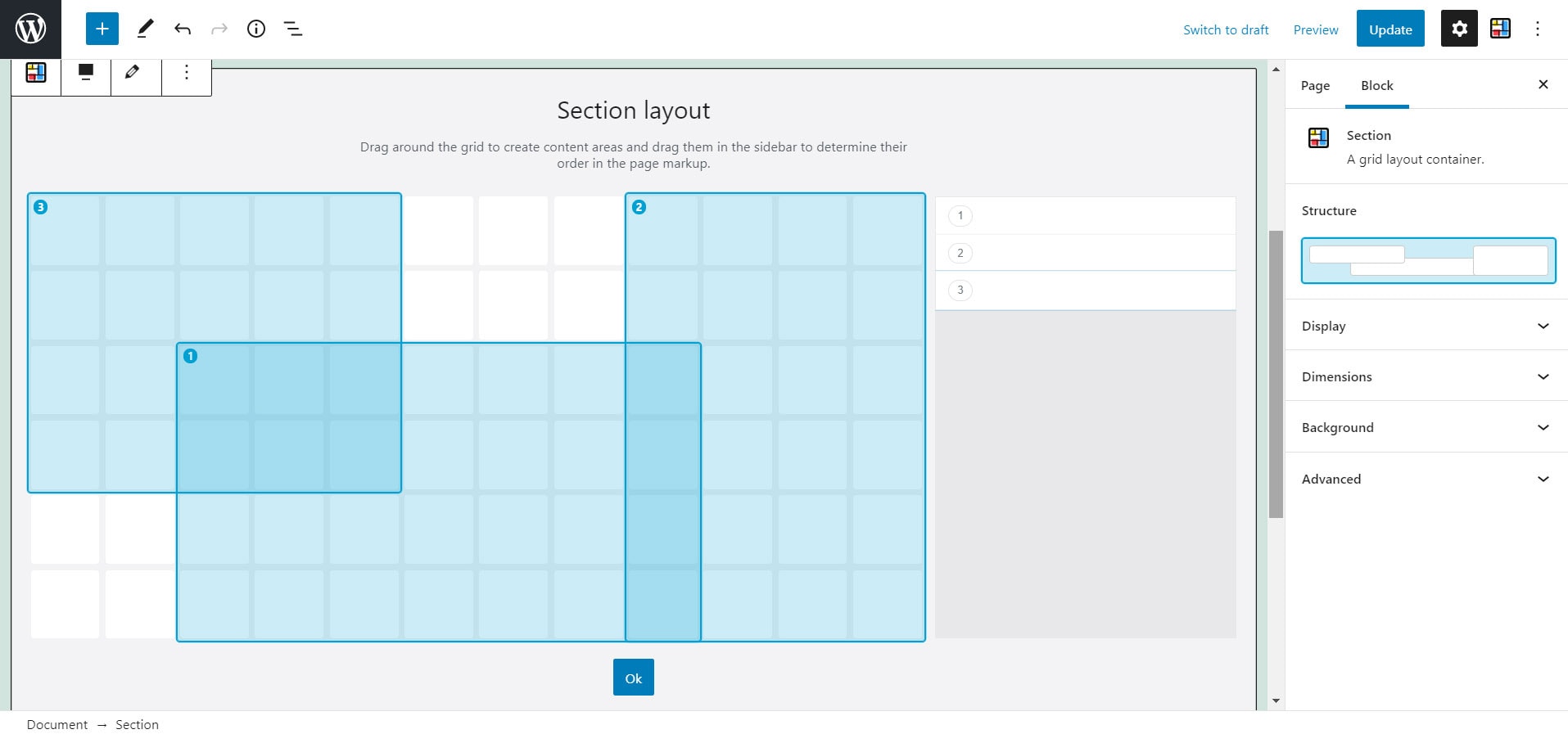
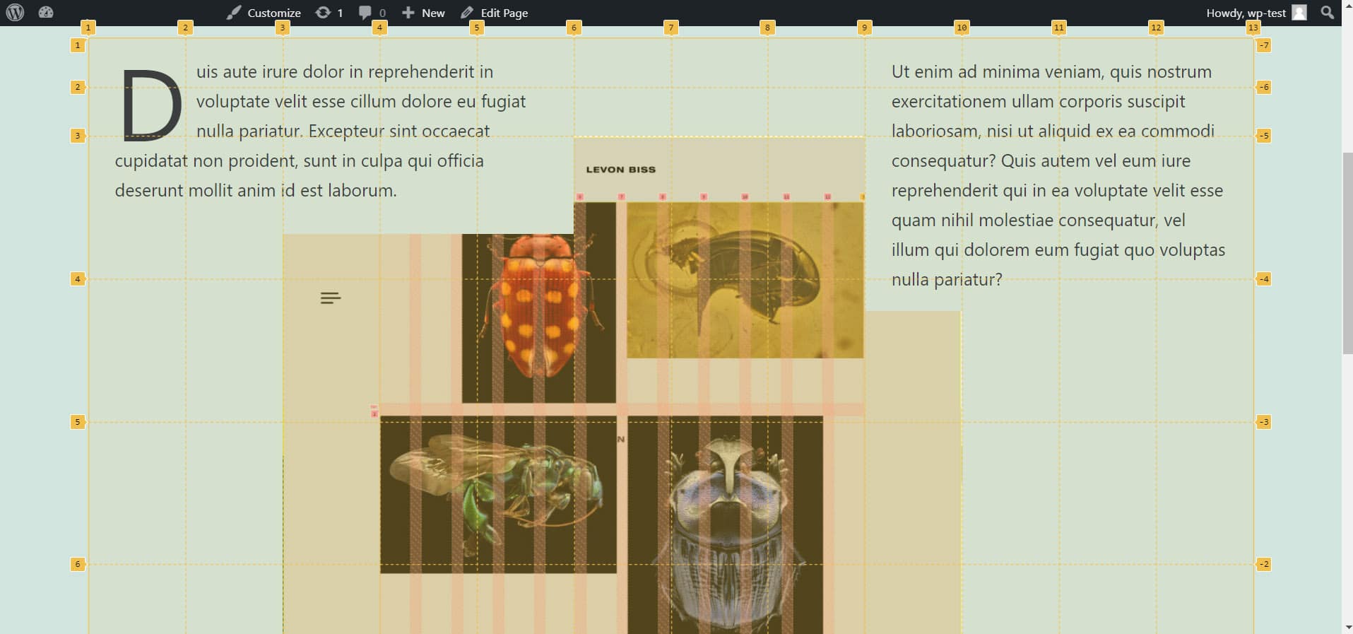
The special thing about CSS Grid is the possibility of overlapping without using negative margin or absolute positioning. And that's exactly what's possible with the plugin. With the help of the z-index and also through the arrangement in the grid itself (the last element is at the top, the first at the bottom), hierarchies can be displayed.
The above example could look like this as a website:
CSS Grid and @media query
CSS Grid can of course be used freely with Flexbox and Media Query. There is, however, a new feature that CSS Grid introduces: minmax()
As the name suggests, this is about minimum and maximum values. You can use this in connection with the columns. Unlike Media Query, it's not the screen size that's queried here, but the size of the element. If the box shrinks so much that it falls below the minimum size, the elements enlarge and move so that it fits again.
Minmax() works in conjunction with auto-fit and may look like this:
.grid {
  grid-template-columns: repeat(auto-fit, minmax(240px, 1fr));
}
Columns are created here that have a minimum size of 240px, but a maximum size of 1fr. In this example, 1fr corresponds to the entire width of the grid. This allows several grid items to be next to each other if there is space, but use the entire width if there's not enough space.
But there are also advantages in connection with the media query. With the help of the coordinates, you can place and arrange your grid items differently for each device. Especially on mobile, where a different hierarchy can prevail than on desktop, this can provide you with a pleasant user experience.
"*" indicates required fields
All special features at a glance
- FR (fraction) as new CSS unit
- Grid areas and lines can be given names
- Grid-column-end, can be used with "span n"
- Set grid alignment to "dense" to fill empty spaces with elements
- Declare the same Columns or Rows with repeat()
- Responsive display with the help of minmax() + auto-fit/auto-fill
- Grid items can be arranged arbitrarily (also overlapping) in the grid
Further sources of information on the topic
- A complete guide to CSS Grid by CSS Tricks
- A guide to learning CSS Grid from Learn CSS Grid
- Everything you need to learn CSS Grid from Grid by Example
- Test your skills: Grid Layout from MDN Web Docs
- Learn all functions of CSS Grid in a fun way with the game CSS Grid Garden
Do you have any other questions?
What questions do you have about CSS Grid? Feel free to use the comment function. You want to be informed about new postson the topic of WordPress and web design? Then follow us on Twitter, Facebook, LinkedIn or via our newsletter.
