We're overjoyed to be presenting our new brand identity to you today and nervously looking forward to your feedback at the same time. A new design for Raidboxes with the same core and values as before. If you're reading this article, you've probably already noticed our new logo, colors and graphic elements. In this article we'd like to dig deeper into what's changed and why.
The idea behind the new corporate identity

Having evolved greatly as a company over the past few years (and admittedly getting a little "fed up" with our old look), we have now made it our mission, with the active support of 360Vier, to develop a new corporate identity that reflects what Raidboxes has become. To create a new appearance that is different from the previous one. Away from the well-known unconventional logo and the different color gradients typical for us, towards something new and grown-up - without losing our old identity.
Six years to become market leader

It all started with a first Dashboard prototype in 2014, implemented by two "salaried" people - Johannes and me. Followed by a first investment in 2016 with five full-time employees at that time. Today we are a medium-sized company and the WordPress hosting experts in Germany, Austria and Switzerland. With currently 48 full-time employees throughout Europe. To make the dimension clearer: We have gained over eleven new teammates in 2021 alone.
For the entire team at Raidboxes, our values are still exactly the same today as they were back then. Of course, we also want them to remain high on the agenda of our customers. Our Raidboxes values have always been:
- Freedom
- Transparency
- Kindness
- Sustainability
- Performance
- Unconventionality
What do we mean by "brand"?
First things first, it's important to explain what a brand actually is, what we mean by brand identity and what we want to associate with it.
"Brand" is a term we use often and you may use it too. But if you look a little outside the box, you quickly notice that we rarely define the term. For us, a brand is a person's gut feeling about a service or a company. As an example: what is your immediate gut feeling when you hear Coca-Cola or Greenpeace? We set out to tackle the question "how do brands create these feelings?" For the rebranding, we divided this question into three different areas:
1. What is our internal relationship with the raidboxes® brand?
This includes our logo, our tone in areas like our magazine and website, how we look on tote bags, t-shirts, digital banners and more.

2. How do outsiders experience our brand?
When people use our products every day, they live the experience we provide while gaining an impression of who we are.

3. How do people share and talk about the raidboxes® brand?
Brands develop a life of their own when we share stories. Or when we talk about brands with people we know.

Quite frankly, we're far more likely to buy something from a strong brand and talk about it with family, friends and colleagues. We're less likely to trust brands that are less appealing to us personally or have even developed a negative image.
Each of us knows some brands that bring certain associations with them. We can probably think of dozens of examples right off the bat – and in the 21st century, there's nothing like trust. Loosely thrown together marketing slogans that might have worked 50 years ago haven't worked for a long time.
Sea Shepherd & Joint Mission
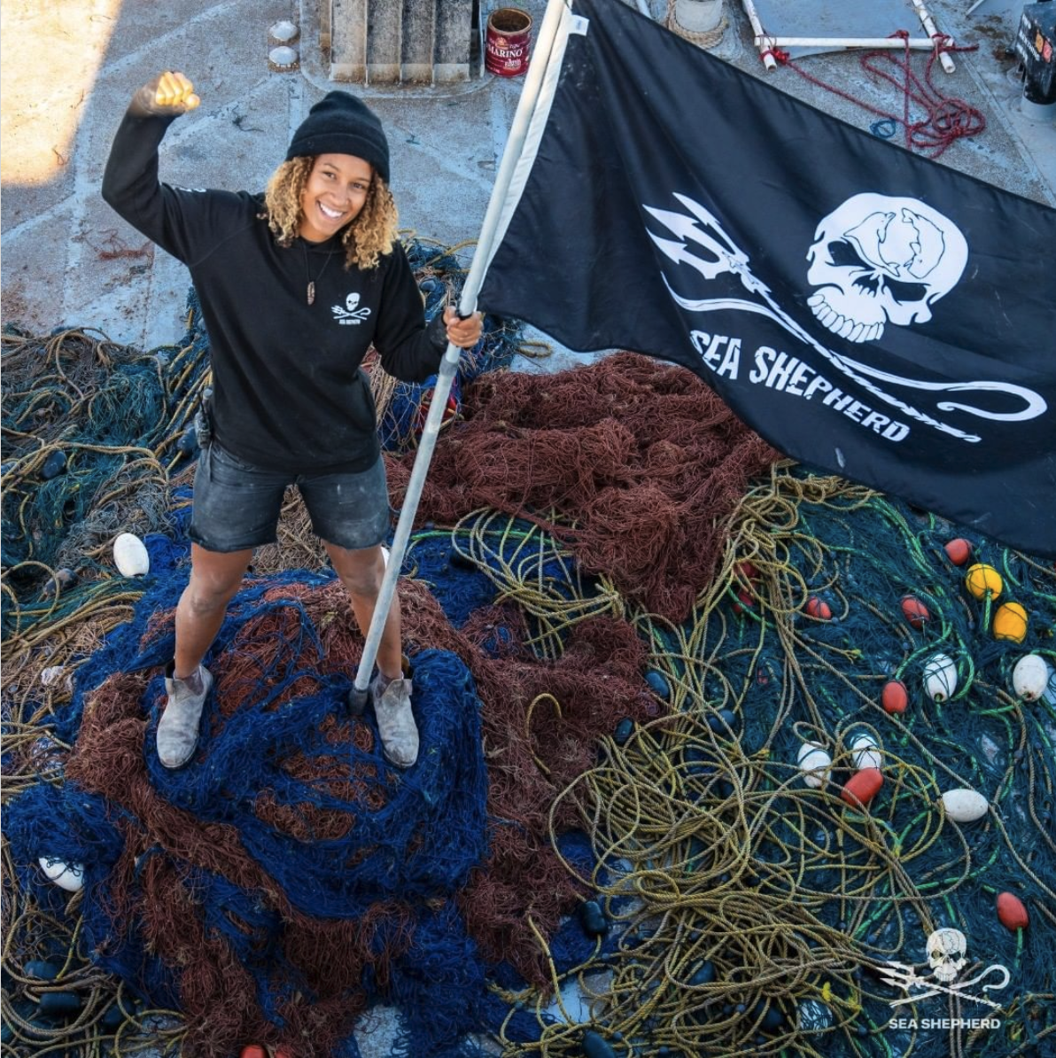
At Raidboxes we talk a lot about sustainability, climate protection and the great tasks facing humanity as a whole. It's not about whether you're personally a fan of the environmental protection organization Sea Shepherd trying to do something about overfishing, oil rigs in the Arctic or forbidden whaling with often unconventional and very radical means. It's about who they are and what they stand for when it comes to our planet.
We could discuss whether it's appropriate for a charity to run Facebook ads to promote donations. Or whether it's okay to sell targeted merchandise in the charity's own online shop. But what no one can deny is once you've engaged with the organization, it's hard to forget its brand presence.

The very clear skull and crossbones with trident in reference to the well-known pirate symbol and the merchandise are unmistakably linked. Almost all active members on the ships can be seen in corporate fashion from top to bottom at all times while they're on board. Emotionally and culturally, everyone involved is strongly interwoven with the brand and its common mission. It makes the message clear: You're one of us!
Performance & Associations of Raidboxes
At Raidboxes we want to be a brand that evokes emotions, just like Sea Shepherd's appearance does. We're not an environmental association and have no relation to radicalism, but we feel as passionate about "Our Values". When it comes to the emotions about and awareness of Raidboxes, we speak the same (figurative) language. We also want certain principles, emotions and associations to be unambiguously linked to Raidboxes.
Raidboxes has always been and will continue to be a business-to-business (B2B) solution. We also have business-to-consumer connections (B2C) and welcome them to our customer base. Our core target group is, however, still agencies, freelancers, WooCommerce online shops or people who earn their living with WordPress – whatever that business may look like!

As a reminder, WordPress is open source software and may not be sold directly. However, the services that arise from the WordPress environment, such as agency services and web design or even WordPress support, are a multi-million dollar business worldwide. Many people live and work full-time from these customized services for WordPress. The best example is probably Raidboxes itself. Born out of an agency business called "Gutado" in 2014.
Creating our new look
In the beginning there was only a white sheet of paper. A white space that wanted to be filled with content. We wanted the new brand to be entirely in the spirit of Raidboxes and in line with our values. Raidboxes has always built on trust and recommendation through creativity, freedom and transparency. In our eyes, this is just as true for our employees as it is for our customers in over 55 countries worldwide.
"For me, Raidboxes represents the passion of free and wild and creative people."
Torben Simon Meier

RAIDBOXES becomes raidboxes®
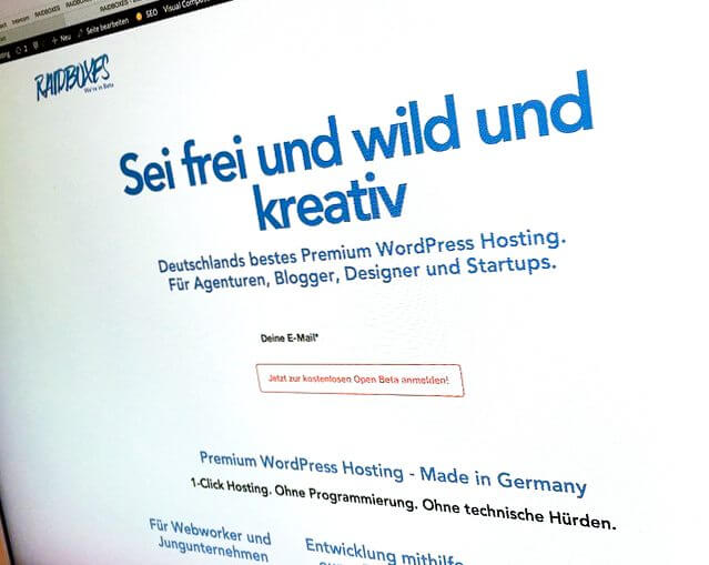
You can say what you want about our well-known brand identity. Some loved it, others weren't big fans of the unique design (of the old logo) and the constant capital letters. Nevertheless, it was the best thing that could have happened for our brand presence, because the unmistakability of the brand was always guaranteed. Whether at trade fairs and WordCamps or webinars and on promotional material. The logo and the name Raidboxes are highly memorable. Unfortunately, the word mark was not flexible.
What is changing?
1. our logo
We will, of course, remain true to our name. In our Raidboxes Dashboard, you'll continue to create Boxes, which includes a WordPress installation and all the familiar tools. Both the logo and the trademark itself will undergo a change.
With the new logo, we're just becoming more mature – but keeping the freedom, creativity and friendliness. In our eyes, the newly created pictogram also achieves this. The Box with the smile in combination with the trademark stands for everything that is important to us at Raidboxes:

- The Box = our name, core product, software, hosting
- The smile = service, friendliness, enthusiasm
- The tilt = playfulness, friendliness, creativity
- The word mark = seriousness, trust and stability
- Friendlier spelling = raidboxes® instead of Raidboxes® (we don't want to "yell" at our customers anymore)
Finally a pictogram
Our new pictogram, which usually forms our new logo together with our name » raidboxes®", is one of the most obvious changes compared to our old brand identity.
Until now, we only had the option of displaying our company name as a word mark, since we didn't have a "real" logo. Quite nice, but if you have little space or also wanted to play with the logo creatively sometimes, it was virtually impossible. The horizontal, slightly slanted placement was fixed at all times.
With this first Raidboxes pictogram, we're also using and strengthening our brand – without always having to use the entire word mark. The possibilities that arise from this are almost endless.
2. Old-fashioned typography
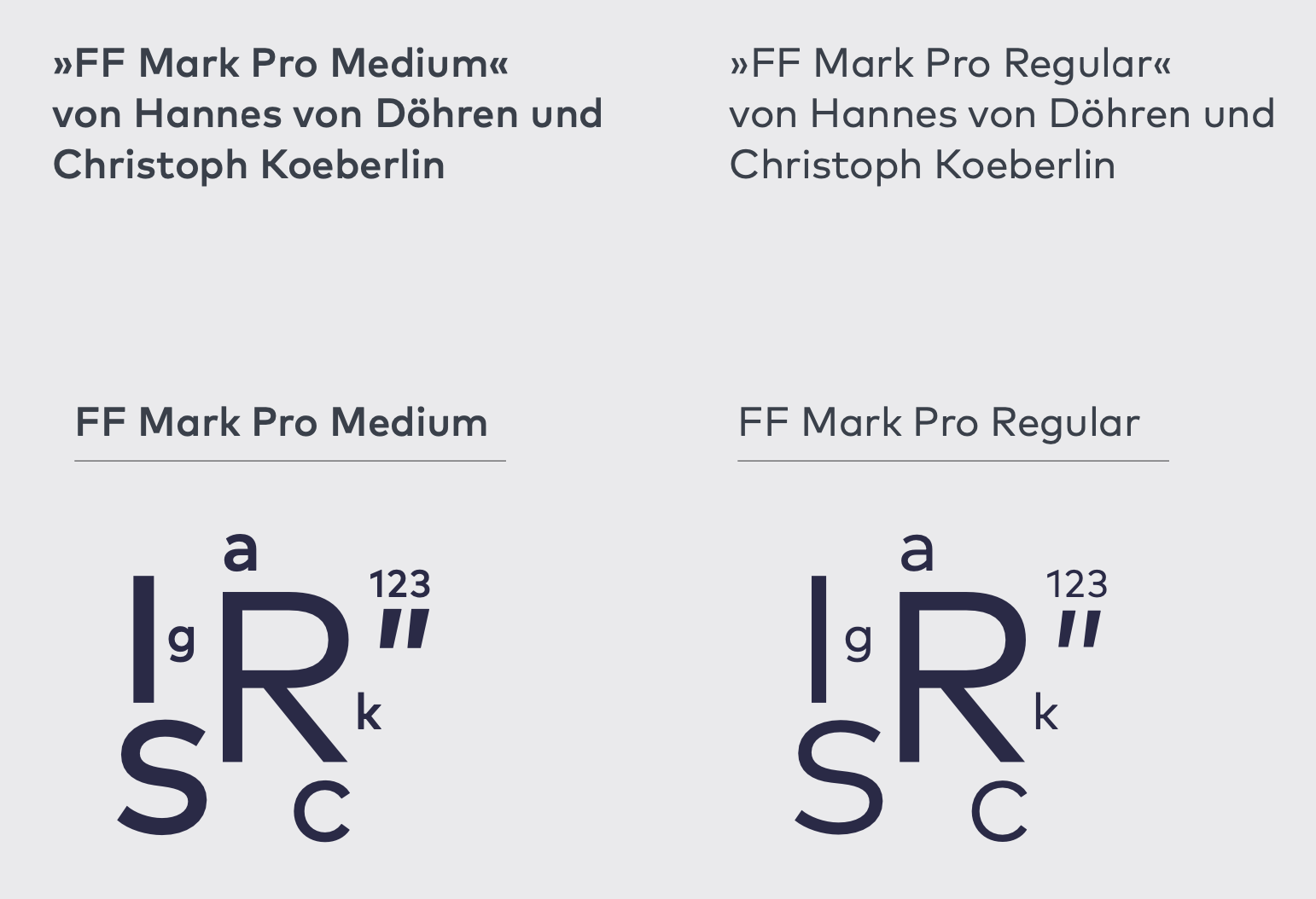
Our font is and remains the same: FF Mark (by FontFont from Berlin). We chose it back then for the launch of Raidboxes in 2016 because it's legible, clear and accessible, but also, according to the creators of the font, "by creatives for creatives". What would suit our brand better than a font like that'
The big difference from the previous appearance is that instead of Google's Roboto, we'll now use FF Mark Pro for continuous text. It has a creative touch and we found it to be just the right font to describe our software and the team behind it.

3. New color palette
Our colors are now no longer based on the familiar mixtures of different gradients in shades of blue. We've consciously decided to distance ourselves from gradients and instead work with clear color accents that underline the change from Raidboxes as a start-up to a "grown-up" company.
Between you and me, all the blue in the old design has the typical hosting character. If you take a closer look at the competitors in the hosting sector, you'll quickly see that blue is the color of choice. And it's understandable, blue does radiate trust and seriousness.
These values are also important to us, but are made clear through other measures. The new word mark with the adapted lettering and our dark blue accents on the new website itself serve as an example.

The other chosen tones are meant to underline what's most important to us apart from freedom: your creativity! The colors are meant to make clear that we're predominantly here for the creative sector and also feel most comfortable there.
In addition, there is a lot of white space. As we mentioned earlier, the beginning of a creative process is usually a blank sheet of paper. We wanted to emphasize this with the help of white space.
4. New graphic elements
Our graphic elements move in a way that shows the range of human creativity: sometimes calm, rounded and gentle, sometimes jagged and full of energy and passion.
The mix of the new colors and lots of white space means you immediately get the feeling that this is an artistic project. That's exactly what we want – to give you more space so you can concentrate on your creativity.

With ups and downs to the new brand identity
We wanted our users to be involved in the development of our website. In autumn 2021, we asked our agency partners what they thought of us and what they associated with the previous website.
The interim results of the first wordmark and the new pictogram were also used in these surveys. Overall, we got positive and approving results from our partners for the colors and the wordmark. This encouraged us to believe we were on the right track in terms of the design elements in combination with the new colors.

The memory still stings a bit but when we look back to the reactions we got to the first drafts, we didn't come off well. The feedback was that the newly chosen pictogram was not very – if it all – self-explanatory. Despite the simplicity of the overall wordmark, the design itself wasn't convincing. So we spent another few months on the pictogram. We had to find a way to emphasize the simplicity of the logo.
"A logo is good when you can scratch it in the sand with your big toe."
Kurt Weidemann, typographer, designer
The pictogram had to meet both our internal and external expectations and at the same time underline what we do: software-as-a-service for the creative industry. We had also involved external freelancers in the pictogram, without satisfactory results. In the end, we came up with the final version of the "happy Box" internally, and we stand behind it as a whole team and company.

We hope you like what we want to express with the logo, why we changed it and how we got there. Without you, our self-reflection would not have been possible!
At this point, a big thank you to our partners and to the agencies and freelancers involved. A big thank you also goes to our partner agency 360Vier, with whom we worked on the creation of the new brand identity and the new website. The graphic elements, the image effect and the structure of the new corporate identity were developed together over months. The collaboration was driven by permanent feedback and creative finding processes - and not always very easy (with us 😅).
Living the Newly Developed Every Day
To experience our new branding - and to make people feel comfortable with Raidboxes - we know that we must continue to provide the best software for our users. We know that we remain committed to doing even more to protect the climate. And that we must always remain true to our vision of global opportunities without borders for all, the values mentioned above and the freedom that guides us.
"*" indicates required fields
Raidboxes is ready for the future
In our eyes, we've created a new brand identity that underlines everything that was and is important for Raidboxes – the only difference is that we've grown up in the past six years. The new appearance deliberately underlines this growth.
Our most important values such as freedom, unconventionality and friendliness are retained. With the help of the graphic elements and the many white spaces on the new website as well as the logo, a large creative stage is created. Old elements such as the typeface are retained to also indirectly keep a certain recognition factor for users.
We hope you see this development as exciting and euphoric as we do, because the most important thing to us is still the same: Be free and wild and creative!
Do you have any questions?
What questions do you have about the new Raidboxes design? Feel free to use the comment function. Do you want to read new articles on WordPress, web design and online business? Follow us on Twitter, Facebook, LinkedIn and via our newsletter for WordPress content and more.

Ich finds scheiße!
Ganz ehrlich, das, was eure Marke ausgemacht hat, war das ihr euch getraut habt anders zu sein. Jetzt hab ich das Gefühl ihr seit genauso wie alle anderen. Das Piktogramm ist völlig nichtssagend und einfach nur langweilig. Aber Hauptsache eine aufwärtsstrebende Bewegung ist drin, damit ja alle Boxen der Logo-Psychologie Grundschulklasse abgehackt sind.
Ich finds sad. Will euch nicht beleidigen und bin weiterhin ein großer Fan von eurem Support und erstklassigem Hosting aber man muss ja noch ehrlich sein dürfen.
Alle großen Brandredesigns der letzten Jahre sind nach dem gleichen Schema F gelaufen. LANGWEILIG!
Vielen Dank für das tolle Feedback, Enrico! Wir freuen uns auch auf die weitere Zusammenarbeit mit euch. Viele Grüße aus Münster 😊
Moin!
Nachdem ich kurz über das komplett neue Design der Website verwundert war (positiv, aber doch sehr unterschiedlich zum alten Design), freue ich mich für Euch, dass Ihr hier einen tollen Entwicklungsprozess durchlaufen habt und mir gefällt Euer neues Logo mit Piktogramm sehr gut.
Das macht tatsächlich die Gestaltung – auch im Corporate deutlich entspannter. Euer Schriftzug war in der Tat immer sehr „aggressiv“ – was zum einen gut, in der Gestaltung aber immer sehr umständlich war.
Ich freue mich auf die weitere Zusammenarbeit mit dem „neuen“ alten Raidboxes-Team.
Herzlichen Dank Jochen. Wir fühlen uns jetzt gut aufgestellt für die kommenden Jahre und möchten die Kreativität und den Freiraum weiter in die Mitte unseres Hostings entsprechend jener primären Kundebasis stellen.
VG
Torben
Hey Torben!
Wow, da muss ich mich erst daran gewöhnen.
Bei Facebook dachte ich schon, da nutzt wer anderer euren Markennamen 🙂
Die neuen verspielten Elemente finde ich super!
lg
Jochen