The doorbell rings and you are handed a parcel. You open it and see 20 black socks. Socks? But you didn’t order them! Oh yes, you did. You just didn’t realise it. How you are manipulated by dark patterns in online marketing every day and how to spot them. With examples of frequently used dark patterns.
What are dark patterns?
So last week you took out the ultimate sock saving subscription online without actually registering it. How did that happen? Quite simply, you were manipulated with a dark pattern in an online shop.
Dark patterns are user interface or design elements or processes that companies use to manipulate consumer behaviour. We are manipulated every day, not only online but also offline, and we don’t even realise it. Or have you never wondered why there are only a few bottles of that wine left in the supermarket? Suddenly you decide to buy exactly this bottle. After all, it must be good if there are only a few bottles left… Right?
Many clever marketers discovered these patterns some time ago and use them on a daily basis. Unfortunately, the success of some dark patterns means that there are more of them, not fewer. Dark patterns range from harmless to fraudulent and have equally harmless to fraudulent purposes.
WordPress hosting management
With our Raidboxes dashboard, you get a seamless, intuitive interface that makes managing your WordPress sites easier, faster, and more efficient. Check it out!
A dark pattern can be a warning notice in an online shop that warns of the expiry of an offer with a countdown. However, it can also be a barely visible notice at the checkout indicating that you are about to take out a sockscription. A dark pattern doesn’t even have to be a visual element. It can simply be an incredibly stressful cancellation process that prevents you from deactivating your subscription.
Why many companies use dark patterns
Why should a company do this? Quite simply, because it works. A 2021 study with 1963 participants found that the number of people who took out a “dubious” service online was more than twice as high when harmless dark patterns were used. When fraudulent patterns were used, there were almost four times as many.
Unfortunately, the interests of customers and companies are often not identical. The more clicks, registrations or purchases you can gain from the user, the better for the company’s account. Good for companies, bad for you. So when companies or marketing teams have to fulfil a certain workload and want to achieve it, they sometimes resort to desperate methods. And that includes dark patterns.
BUT: Although dark patterns are good for achieving short-term goals (such as increasing sales), they often damage the company’s image in the long term.
How do dark patterns work?
Honestly, do you read every single line on a page? Most people don’t. Most of the time we skim and scan a text to get the context as quickly as possible. We not only skim text, but also user interfaces. Dark patterns utilise our brain’s natural tendency to save energy.
Our brain is lazy. It wants to save as much energy as possible. This is precisely why it scans, skims and does not read carefully. Behavioural patterns that have already been learned are called up again and again to make decisions. This is exactly where dark patterns come in. We quickly ignore the small print and click on buttons without understanding what we are agreeing to.
Subscribe to the Raidboxes newsletter!
We share the latest WordPress insights, business tips, and more with you once a month.
And this is not a fault of our brains, but completely understandable. We are inundated with an enormous amount of information every day and have to make decisions all the time. Reading notifications, clicking buttons, accepting notifications, reacting to likes, writing comments… There is simply no time to make informed decisions.
Every time we visit a page, we decide to click on “accept all” without knowing what “all” actually is. We simply don’t have the nerve to deal with “everything”. And the large, blue “Accept all” button is also much more conspicuously designed than the small, grey, inconspicuous button. Our attention is specifically directed and used to the advantage of others.
To summarise: Our brain is completely overwhelmed. This is precisely why dark patterns work so well. Many of these techniques utilise the limited perception of us humans.
But when is a design pattern really “dark”?
As soon as people have difficulties cancelling expensive subscriptions or contracts and suffer financial, personal or data-related disadvantages, a design pattern is called “dark”.
For example, if a website has a visible button to take out a subscription, but the options to cancel this subscription are hidden somewhere, this is a dark pattern. This is because having the option to subscribe for the next 10 years is usually not in the best interest of the customer, but of the company. The rule for dark patterns is actually quite simple: whenever only the company benefits from it, it is a dark pattern.
This includes many things. Everyone knows the cookie banners on websites. The focus is often on the button with which you accept all cookies, while the area in which you can protect your privacy is hidden. Who benefits from this? The company, of course, not the user. So, dark pattern.
To summarise: If a design pattern is not in the best interest of the user, then it is usually a dark pattern.
WooCommerce Hosting
With WooCommerce hosting, you can launch your own online store quickly and securely and manage it professionally – without any technical hurdles. Check our Raidboxes WooCommerce Hosting now.
Are dark patterns legal?
Yes and no. It is often difficult to recognise the boundaries between manipulation and fraudulent intentions. The individual dark patterns are not (yet) explicitly regulated in national and European laws (as of January 2023). However, anyone who has suffered damage as a result of dark patterns can theoretically try to claim compensation.
Of course, there are laws such as the GDPR or the TTDSG that more or less regulate the use of dark patterns, at least in terms of data protection. As recently as 2022, Google and Facebook, for example, got into trouble for their cookie banners. Both companies violated EU and French regulations by not allowing users to reject cookies in their cookie banner just as easily as accepting them.
This has cost Google 150 million euros and Facebook 60 million euros in fines. TikTok and Microsoft are facing similar penalties in France. Dark patterns can therefore not only significantly damage a company’s image, but also its turnover.
Examples of frequently used dark patterns
Dark patterns are everywhere. A study conducted in Europe found that 97 per cent of the most popular websites and apps used by consumers in the EU use at least one dark pattern.
These dark patterns come in a wide variety of guises. Sometimes they are harmless, sometimes fraudulent and deceitful. To help you recognise and react to them in future, I would like to introduce you to the best-known dark patterns:
Activity notifications
“This accommodation has just been booked again!” Has it really been? Activity notifications are often artificially generated references to a purchase, booking or activity that has just taken place. This creates artificial pressure through the feeling of scarcity.
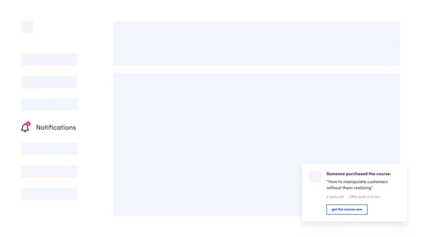
At the same time, it triggers your feeling of wanting to do the same. If so many others are doing it or have bought it, then the product must be good and you can buy it without hesitation…
This addresses our herd instinct. Because we like to behave like others in order to make decisions easier. Unfortunately, these activity notifications are often not based on real data and information. In other words: dark patterns, because false information is presented here.
There is another type of activity notification. You’re probably familiar with them: The little dots on social media platforms and apps that indicate unread messages. These notifications are intended to encourage users to quickly check whether they have missed an important message. This is also a dark pattern. Especially when there is no news at all and the notifications are only used to lure the user back to the app or website.
Some apps even go so far as to display the dot continuously on the app icon to attract even more attention. This type of dark pattern is particularly harmful as it generates continuous notifications and puts the user in a constant state of anxiety. They can even go so far as to cause a kind of addictive behaviour.
Repeated disturbance
You are scrolling through a website and suddenly a pop-up appears advertising a newsletter. You close it and after a few seconds, it pops up again. And again and again and again. This pattern is not considered dangerous, but it is annoying!

It’s about doing something that’s good for the company, but not necessarily for the users. This includes having to sign up for a newsletter in order to receive a discount. The idea behind this is that the more often you repeat something, the more positively it is perceived. This principle comes from behavioural economics and is called the mere-exposure effect.
Unfortunately, this principle no longer works so well these days. We have learnt to ignore content that resembles advertising, is in the vicinity of advertising or appears in places that are traditionally intended for advertising. And if there’s one thing that looks like an advert, it’s a pop-up.
Roach Motel and enforced continuity
These two dark patterns are often combined. With the so-called Roach Motel, it is super easy to create an account or take out a trial subscription. However, if you want to delete the account or cancel the subscription, it is particularly difficult. To do this, you have to send an e-mail, send a letter or call directly. The main thing is to create as big a hurdle as possible.
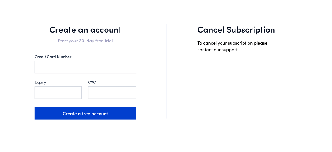
Forced continuity is then also used when logging in. For example, you can often register “free of charge”, but you have to enter your credit card details when you register. This is usually a warning sign of forced continuity. The credit card details are used to charge the corresponding costs for the actual subscription after the trial subscription has expired. This often happens without any indication of automatic billing.
The combination of the two patterns creates real dark pattern fireworks. Why Roach Motel? The name comes from the phrase “Roaches check in, but they don’t check out!” meaning “Cockroaches check in, but don’t check out”. In this case, you can check in, but you’re not supposed to check out.
Sneak into basket
When you shop online, some shops use a sneaky tactic to add items to your basket without you realising it. This is known as “sneak into basket”.
Here’s how it works: you add an item to your shopping basket and somewhere in the checkout process, a supplementary product is automatically added. This product is mentioned, but the hint is so inconspicuous that it can easily be overlooked. For example, if you buy a laptop, an additional “sneak into basket” product could be a laptop sleeve. After all, you don’t want to leave your laptop unprotected, do you?
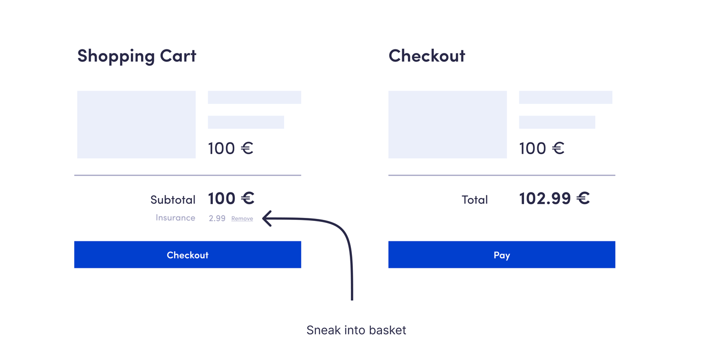
If the item does attract attention, an additional trick is used: The price for the additional product is chosen so that it hardly hurts. An item for €1.99 is hardly noticeable and you get something for next to nothing!
But that’s not all. There’s another trick. The items don’t necessarily have to be physical, but should simply give you a feeling of security. This could be insurance or an extended warranty, for example. You’ll find this especially with technical items. These tricks are all linked to the “sneak into basket” pattern to make the product appear less “sneaky”.
Preselection
This pattern shows a product with two options, one of which is preselected. However, this option is not necessarily in your favour. A great example is the “savings subscription” of a well-known, very large global online retailer whose name begins with the letter “A”.
Instead of just selling a single product, two options are offered here. The single product and the “savings subscription”. The savings subscription is partly set as a pre-selection so that a subscription is taken out when you click on “add to basket”. And then the socks arrive every month instead of just once. But you also save one euro with every purchase. 😏

Another example is the preselection for a newsletter registration. You only want to register for one service, for example, and during this process the “I would like to receive the newsletter” box is ticked by default. The preselection pattern is the most frequently used dark pattern, together with the “hidden information” pattern.
Hidden information
With this pattern, important information and options are hidden or displayed in such a way that they are barely perceptible. To see the information, you first have to click somewhere, look very closely or actively search for it. This pattern is particularly common in emails.
Every newsletter email must allow you to unsubscribe. But just because you have to have the option doesn’t mean you have to make it visible! So the “unsubscribe” link is simply made invisible or almost invisible in the email. Black text on a black background is rather difficult to read, as is very small text.
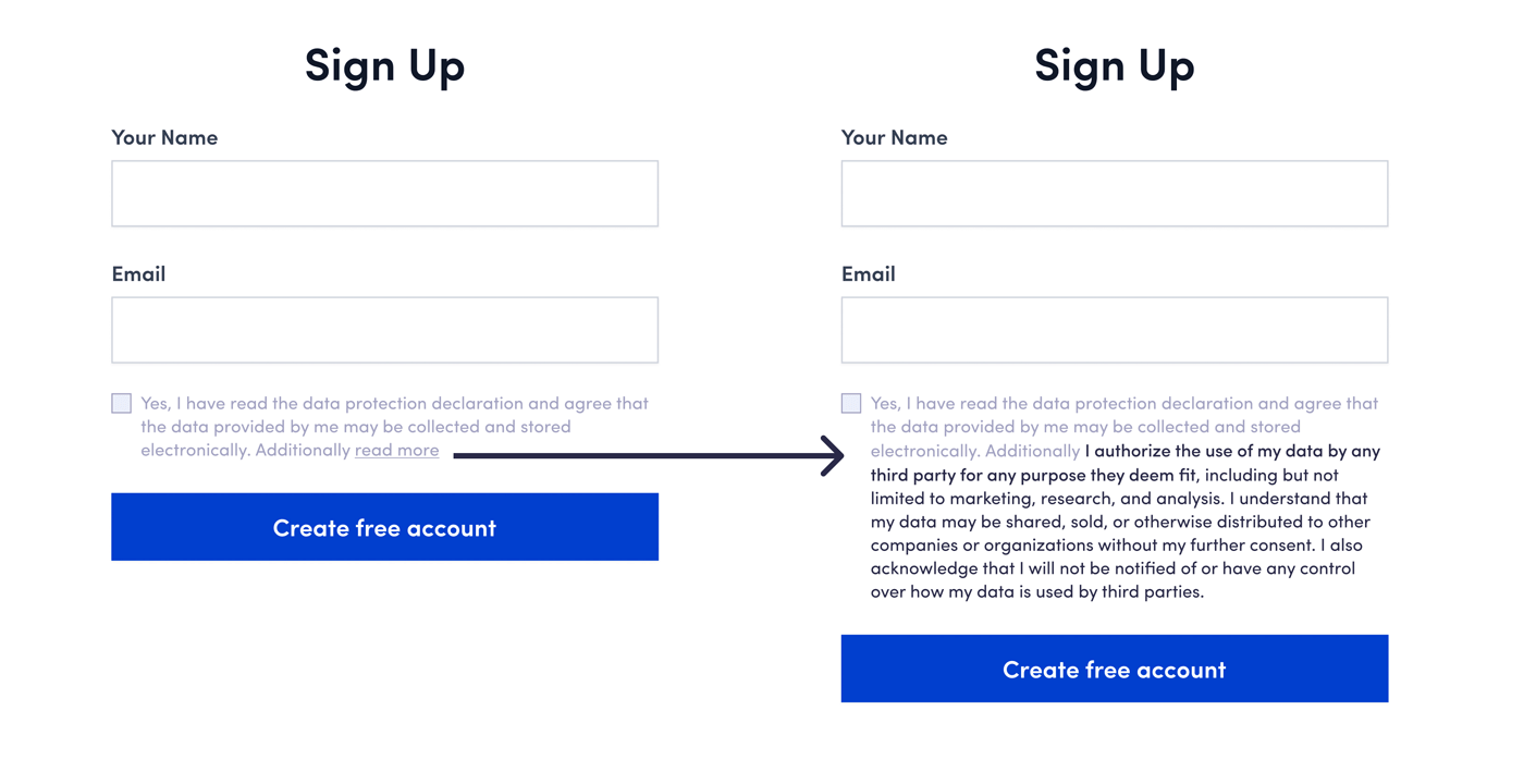
You will also find this pattern in cookie banners. Here you first have to click on “all settings” or similar to reject the cookies. You will find this type of deception on almost every page in one way or another.
Confirshaming
With Confirshaming, you should be ashamed if you choose an option that is not in the interests of the provider. And then change your mind because of it. This pattern is usually found in newsletter registrations or notification settings.
For example, if you don’t want to sign up for a financial blog newsletter, you first have to click on “No, I want to stay poor”. These types of texts range from “No, I don’t want any offers” to “No, I prefer to bleed to death” or “I don’t want to support a good cause”.
Artificial scarcity
Only 2 left! Only 4 hours left until the offer ends! Only 10 places left for this workshop! Artificial scarcity is used to stimulate purchases. This can take many different forms:
- Shortage of time
- Shortage of quantities
- Scarcity of access
We make decisions more quickly under pressure. The decision is then often made automatically on the basis of scarcity alone. After all, nobody wants to miss out on a great offer.
How you can protect yourself from dark patterns
There is a way in which you can actively protect yourself from dark patterns. You just need to understand one small thing. According to Nobel Prize winner Daniel Kahneman, our brain runs in two modes. The carefree mode and the performance mode.
In carefree mode, our brain tends to run on automatic. It doesn’t read so carefully, uses familiar behavioural patterns and tends to make decisions based on gut feeling in order to save energy. You may be familiar with this mode from driving a car. After all, we don’t spend every second thinking about how to accelerate or brake. In carefree mode, we are very susceptible to dark patterns.
To recognise and counteract dark patterns, you need to switch to performance mode. In this mode, you read carefully and think before clicking on a button. Here, you pay attention to the small print of attractive offers, recognise a pre-selection and don’t jump at every offer.
The future of Dark Patterns
Dark patterns are nothing new. Companies have always tried to manipulate us by using a certain type of language or imagery. The difference to the past is that our world and therefore the possibilities for manipulation are more complex, faster and much more difficult to control.
Voice assistants and smart home devices give dark patterns new opportunities to creep into our everyday lives. The further development of artificial intelligence will make dark patterns even more individualised, inconspicuous and suitable for the masses. And augmented reality will provide companies with even more data to integrate dark patterns into reality.
The challenge is that we as consumers have to protect ourselves against dark patterns. Realise that dark patterns exist. Once you recognise them, you can actively start to resist them. We must not allow ourselves to be blinded by tempting offers and not just act according to our gut feeling online. Because dark patterns are never about our advantage, but always about the advantage of the company.
Your questions about dark patterns
Do you have any questions about the article? Then please feel free to use the comment function. For more insights on WordPress, web design or online business, follow Raidboxes on Facebook or LinkedIn – or subscribe to our newsletter.
Leave a Reply