
How can you make your website a pleasant experience for mobile users? What does user experience mean for mobile devices? Which design principles can you apply? You’ll find the answers to all these questions in this article. Let’s take a closer look at the best practices for mobile UX design!
Why mobile UX design?
Design movements such as Mobile First have been trying to shift our attention towards mobile phones for some time. Most professional websites now work well on mobile devices. Of course, conscientious designers contribute to this. But even those who run a WordPress website often use frameworks such as Bootstrap or ready-made WordPress themes. Responsive display is usually already integrated here. This saves developers an incredible amount of time.
However, the use of Bootstrap, WordPress Themes & Co. harbours the risk that the design is designed for desktop – and then only adapted for mobile devices.
Why is this a problem? Visitors who view your WordPress website via mobile devices have different needs that are not necessarily satisfied by the aesthetic and technical customisation of the WordPress website alone.
User experience design is based on problem solving. The initial question here is always: What problems can users have and how do we solve them? In connection with mobile devices, you should therefore consider one central question: What additional problems arise when users visit your WordPress website from a mobile device?
Smartphone use in Germany
According to Statista.com, 97.5 percent of households in Germany had one or more mobile phones in 2020. This results in a share of 80 percent of mobile Internet users. Of these, 24.1 percent used a prepaid contract. An increase of 66.5 million smartphone users is forecast for 2023 to 68.6 million.
Many of us use our smartphones on the move. The user experience is strongly influenced by external factors: it can be noisy around us. We may also be on the move – interaction with the phone is less accurate. The lighting can change rapidly between bright and dim. Reception can alternate between good and poor or even drop out completely. Visitors to your WordPress website may use prepaid tariffs and therefore try to avoid websites that consume a lot of data volume in a short period of time.
Planning WordPress projects: From requirements to implementation
We spoke with Ben Hutchison-Bird from NINE Brackets about key strategies for translating client needs into successful WordPress and WooCommerce projects.
The position can be less comfortable and your users less relaxed as a result. We generally have less patience because we have less time for individual tasks. If something doesn’t work in the shortest possible time – or if we have to wait too long for content to load – we tend to cancel the process on the smartphone and devote our brief attention to another WordPress website.
We are also less willing to read or scroll through a lot of text. We are looking for clearly structured information in small chunks. We may also only have one hand free.
The reasons for surfing the Internet on a smartphone are very different from those of desktop users: On mobile phones, we either want to search for specific information or try to kill time.
When I navigate to a commercial website from my smartphone, I’m probably most interested in the basic information:
- What is the address?
- How do I get there?
- What are the opening hours?
- How can I get in touch?
- Which products are offered?
- What are the prices?
The only question that remains is: Is your WordPress website mobile optimised? To better summarise what this means in detail, I have summarised the most important UX principles for mobile design.
Subscribe to the Raidboxes newsletter!
We share the latest WordPress insights, business tips, and more with you once a month.
13 Mobile UX design principles
1. contents
Visitors to your website have different goals depending on the devices they use to access your website. Long texts on mobile devices often mean a lot of scrolling to find what they came for. As mobile users, we are mainly looking for quick, concise information. Anyone visiting your shop on mobile is more likely to want to know what products you offer than to find out more about your background.
Content must therefore be adapted. There is a different hierarchy on the smartphone and tablet than on the desktop. There are several options here:
- Omit content completely: For some content, it may be a good idea to hide it completely. This may be the case if it is something that does not work on the phone anyway. Or if the data volume used would exceed the benefit for the user.
- Shorten content: You can keep the structure of your WordPress website as it is, but shorten long content accordingly and link to a subpage, for example. This allows visitors to decide for themselves whether this information is relevant to them or not.
- Change the arrangement of content: You can revise the structure of your content and arrange it differently on mobile devices. The products could then come first and the background to the shop later. This saves you unnecessary scrolling, but still displays all content.
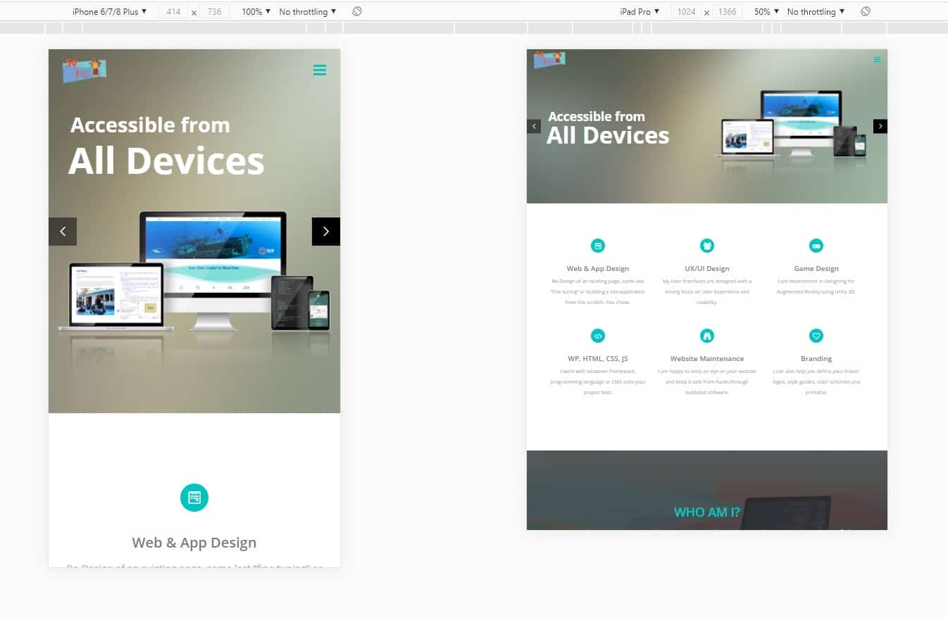
In the following example, I have adapted the content of a restaurant’s website (left) to make it more friendly. I shortened the text and used a CTA to link to a subpage (right). I also adapted the typography, but more on that later.


2. layout
In his article Design for Fingers, Touch, and People, Steven Hoober reports on the results of his extensive research into the use of smartphones. The thumb technique is often used as a reference point. What counts here is the radius that the thumb can make over the screen. It is often suggested that the upper corners are absolute taboo zones that users cannot reach. According to the results of his research, however, this is not entirely true.
The 6 most common ways smartphones are held:
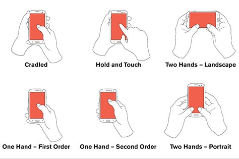
This results in the following optimal division of the elements for smartphones:
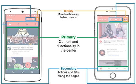
The result: The most important information should be positioned in the centre of the screen on mobile devices.
3. minimalism
A minimalist design approach is never wrong. But especially on a smaller device, we feel cramped and confused by too much content and too little whitespace. It becomes unclear where which information is hidden and how to get there.
The mobile version of Streetartnews is structured and clear. The content pages contain only the most necessary elements and an easy-to-read serif font with appropriate line spacing:


4. consistency
It is important that your website is consistent across platforms. Google has solved this very elegantly. No matter which device I access Google from: I recognise the Google brand immediately.
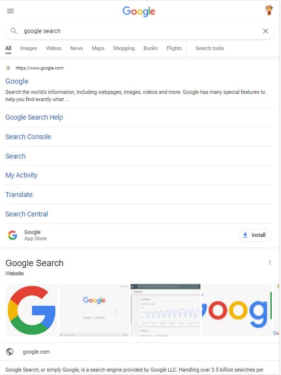
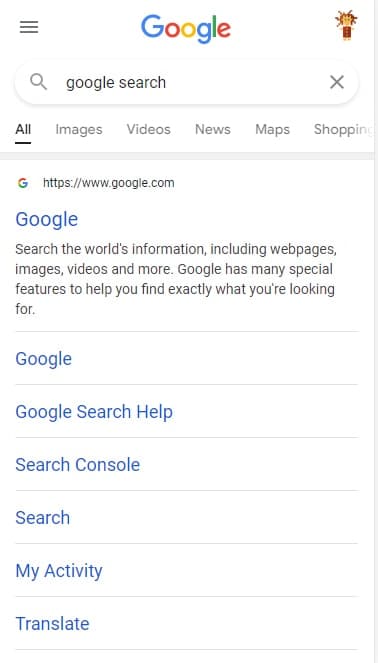
Your brand should therefore also be reflected on mobile devices despite its minimalist design. If your website has a user area, any changes made must be adopted accordingly on all devices.
5. media
Images should have a suitable size and be displayed in this size so that nothing needs to be distorted or scaled. This also avoids unnecessarily long loading times. The transition between landscape and portrait format can be the most difficult: Depending on the image content, you should either only show a part of the image or store your images specifically for mobile devices. For websites with many images, you should integrate Lazy Load or use the corresponding WordPress plugins.
Optimize WordPress images: 6 plugins for image compression
Optimizing graphics and images for your WordPress website is a simple and important step in improving your loading time. We show you six popular WordPress plugins that completely relieve you of the compression of your images.
The same applies to videos. Here too, the camera switches from landscape to portrait. Videos should also be set so that they are muted and do not start automatically. Videos should generally be optimised for the web, but this is particularly important for mobile devices.
6. typography
The functionality of your website is always more important than its appearance. This also includes legible text. The standard text size in HTML is 16px. This size is used unless you specify otherwise. Depending on the font, however, your text may appear larger or smaller.
Everything about web typography and fonts
As a rule of thumb, a font size of 16px is ideal for body texts and text input on smartphones. You can find further input about typography on the web in the blog post „Type Sizes for Every Device “ by UX Matters.
To make typography more legible, however, there are a few other things to consider:
- Contrast between font colour and background: This is particularly important because mobile devices are also used outdoors. This also applies to the rest of your website. A good contrast between elements makes it easier to view your website. ContrastChecker.com analyses your choice of colours and lets you know whether combined colours contrast sufficiently with each other.
- Spacing: If your text is too close together, it becomes increasingly difficult to read. The line spacing on desktop and mobile devices may well be different.
- Centring: My basic rule is never to use justified text on websites. Justification may look nice at first glance, but it interrupts the flow of reading. A centred font has a similar effect. Text sections on mobile devices should therefore only be centred in special cases.
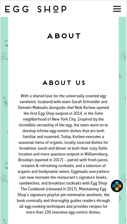

Here again the example from EggShop: To make the text (left) more readable, I have increased the font size to 16px and set the line height to 1.7 (right). I have also centred the text on the left and reduced the spacing at the top and removed the double heading. In the desktop version, the double heading makes perfect sense. On mobile, it only creates unwanted whitespace and duplication.
You could go a little further and make keywords bold. This would allow users to skim through the text even faster and still pick up relevant information. Some fonts are generally not suitable for small screens because they lose their legibility when scaled. Even light fonts that look elegant on a desktop can be less legible on a smartphone.
7. navigation
The navigation of your website should be as intuitive as possible. This means that when creating your navigation architecture, it is best to orientate yourself on existing structures. This makes it easier for users to navigate through your website. For example, scrolling down and up to navigate through a website is intuitive, but not necessarily to the left or right.
A vertical menu has established itself as the primary menu on mobile devices. But even on the desktop, we are increasingly seeing a vertical menu instead of a horizontal one. The secondary menu is usually located above or below this, if necessary somewhat less prominently. Alternatively, this can also be located at the bottom.
Secondary menus can be language settings or social media links, for example. If a tertiary menu is required, this is accommodated as a fold-out menu. This can be a login or logout, for example.
If your website is more than a one-pager, it is particularly important that visitors can always easily find out where they are.
CTA & Links

Interactive elements should be displayed larger. This way, visitors to your website know what they can do on your website. And they are able to click on what they want. The arrangement in relation to each other also plays a role. Sufficient space must be left to minimise the risk of accidentally clicking the wrong link or button. Buttons such as “Log out”, “Delete” and “Send” should also be placed at a distance from the other call to actions so that they are not triggered accidentally.

Hidden interaction
It is quite common to allow interactions through multiple channels. As long as there is a way for new visitors to use your website anyway. This allows you to offer returning users shortcuts without making it difficult to get started.
Upselling, cross-selling & measuring success
Discover how to effectively measure and boost cross-selling opportunities with actionable strategies tailored for agencies and freelancers on the Raidboxes blog.
Links
If you want to add more functions to your website, it makes sense to use existing systems instead of programming new ones. This applies, for example, if the user’s email client is used instead of a contact form. Or when integrating directions through the user’s favourite app. This makes it easier for them to use your website insofar as they can use apps they have already learnt to solve certain tasks.
8 UI Design Patterns
As with desktop, it is a good idea to use proven solutions, also known as UI design patterns, when creating your website or e-commerce store. Some of these patterns are cross-device, others are more specific. This e-book from UXPin has also proven to be a good point of reference.
Small screens in particular offer little space for navigation. Unstructured and confusing websites stand out in a particularly negative way.
Similar to the UI design patterns, it is advisable to take existing websites and successful web apps as a guide and analyse them:
- Where is the menu usually located?
- What does it look like?
- What happens when I press it?
However, you should proceed critically so that you don’t copy any errors or “bad” UX elements.

9. forms
Long forms can be tiring and quickly appear confusing. In general, you should only use forms on mobile devices when necessary. When integrating forms, you should make sure that you only request as much data as is actually necessary and provide users with the appropriate keyboard. You can do this by using suitable HTML form types. This tells the browser what the input is. And the appropriate keyboard is provided.
Alternatively, you can integrate automatic completion or suggestion of content. Or use the social media login instead of a lengthy registration process.

10. feedback
As we use mobile devices with our hands, we expect to receive real feedback: feedback that is based on real objects. This could be a button, for example, that gives the impression of being pressed in when we press it.
If this type of feedback doesn’t fit into your concept, it’s still important to give some kind of feedback. Who hasn’t pressed a link or button many times in a row and been unsure whether it simply doesn’t work or the internet connection is lost? This needs to be avoided. There are common tricks for this, such as loading animations. It is important that users know that their interaction has worked and that something will happen.
11. error handling
Mistakes are made. You accidentally click on the wrong link and end up on the wrong website. Or you send something that wasn’t ready yet. It is important that mistakes have no (or as few as possible) negative consequences. Undo functions and back buttons are suitable for this. The home button is also incredibly important here: the anchor if your users do get lost. This means they always know how to get back to the start page.
12. speed
The loading time of your website can also be a problem on mobile devices. Especially when accessing from unstable networks, the waiting time should not be so long that it discourages visitors.
13. accessibility
WordPress Accessibility: How to create a barrier-free website
Accessibility in WordPress is an important component when creating websites. But how barrier-free is WordPress? Why is accessibility so important? And how is your website accessible to everyone? If you ask yourself these questions, our WordPress Accessibility Guide is for you.
Accessibility is a cross-platform topic that is finally becoming more and more important. The basic idea and mission: The web must be accessible for all people. This is particularly relevant for people with disabilities that can affect the way people access and use the web.
If you ignore the issue of accessibility, you are already excluding 20 per cent of the world’s population from being able to use your website. In short, neglecting accessibility is not good for your business. But more importantly, it’s terrible for creating a fairer and more just world.
Tools for UX testing
Depending on how your website is structured, you may be able to edit the mobile view directly. As a rule, however, you will need to make a few manual CSS adjustments. There are several options for testing:
- Inspection tools in the browser: The most common browsers allow you to inspect your website with the so-called developer tools. There you can also check your website in different device sizes. Other good tools for website testing are Responsinator and BrowserStack Responsive.
- On the device: The most effective way to view your website is on the device itself. Testing on your own mobile phone or tablet is therefore a must. As it would be very expensive to have every device at home, there are so-called emulators.
- Emulators: This software is provided by the operating system manufacturer itself. You can develop there and see your results directly in the browser – tailored to the size of the device and the respective operating system such as Android or iOS.
Conclusion on mobile UX design
If you implement these tips, you can make mobile use of your website a better experience and attract more customers. And perhaps the examples and best practices will help you develop new ideas for your website. Unfortunately, mobile design in particular is still often neglected on a website – which has a negative impact on the conversion rate of mobile users.
For more input on mobile UX design, I recommend Google’s Web Fundamentals and this article for better mobile UX design.
You want to switch to Raidboxes?
What questions do you have about mobile UX design to Sonja? We appreciate your comment. For more insights on WordPress, web design or online business, follow Raidboxes on Facebook or LinkedIn – or subscribe to our newsletter.
Leave a Reply