You've probably heard of the 80/20 rule. But do you know how to apply it to usability in UX design? I took a closer look at some psychological findings and considered them in relation to user experience.
Psychologists have been trying to understand why humans behave the way they do since time immemorial. What motivates us to make certain decisions? Which events are most likely to be remembered? As a designer, you can also benefit from their insights. I've summarized a few well-known rules regarding product and UX design for you here.
Occam's Razor or "Law of Thrift"
In its original form, the law states something like this: "Entities should not be unnecessarily multiplied." Over time, however, the original meaning of this rule has been somewhat strengthened by frequent citation, application, and further development, and has thus evolved into the so-called "Law of Thrift".
All applications should be kept as simple as possible. If two approaches are available for an entity that both state exactly the same thing, then the simpler variant should always be chosen.
How can you apply that to UX design?
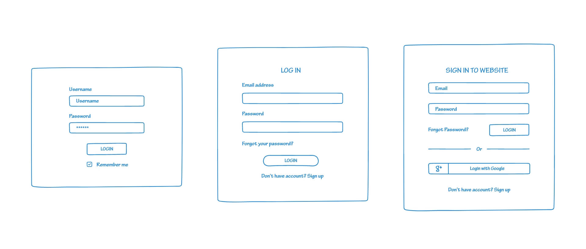
The term "simple" often leads to misinterpretations here. Let's take a look at the following graphic. Is the drawing that looks the simplest actually the one that makes it easiest for your users?
This is only true if nothing goes wrong. However, we must always be aware that users may not be able to log in without problems. For example, an account may not yet exist or the login data may have been lost.
In this case, the middle drawing would be the simpler approach. But maybe you have found out through a target group analysis that most of your users have a Google account? Then the third approach is the right one. Because here you spare your users from having to enter their email and passwords. By allowing them to use a known account, you save them valuable time.

Zeigarnik effect
This approach comes from Bluma Zeigarnik, a Russian psychologist in the early 1900's. Her research showed that people of all demographics are more likely to remember unfinished tasks than completed ones.
How can you apply that to UX design?
This effect has two sides. You can use it to entice your visitors to consume more of your content. For example, instead of a full headline, you can just present a teaser. This way you arouse the curiosity of your users to consume more of your content.
However, it has a negative impact on the usability of your website if an interaction cannot be completed.
This can happen, for example, if there are technical difficulties so that forms or orders cannot be sent. Or if there is no feedback after visitors have signed up for a newsletter.
However, this rule is often used to make users do something they don't want to do. This is often used when a certain amount of time has already been invested in a process (such as filling out a multi-page form or installing an app), only to find out, for example, that registration is required or that something must be purchased in order to continue.
Goal Gradient Hypothesis
Again, this is about tasks and the time already invested to complete them. According to this thesis, we tend to want to complete a task in which we have already invested a certain amount of time rather than leave it. Furthermore, it states that we speed up as we approach the end.
How can you apply that to UX design?
This knowledge is primarily interesting together with the Zeigarnik effect. So it makes sense to build up a sequence with simple tasks first. You should save the more complex tasks until the end. To let your users know that the task will be finished soon, you should always show an indicator that tells them where the person is in the process. This can be integrated for all processes, such as completing a purchase, signing up for a newsletter, or registering.
Serial position effect
This effect was discovered by Hermann Ebbinghaus, a German psychologist. During his countless researches on memory, he found out that we can remember the first and the last things of a series best.
How can you apply that to UX design?
Checklists or bulleted lists of any kind should be designed so that the most important items are at the beginning and end.
Even with long dropdown menus, you should never forget that users don't remember all the content. Price comparisons, as in the following example, benefit from this effect. The first and last price remain concisely in the memory.

Peak End Rule
Similar to the serial position effect, what matters most here is what we perceive last. This principle explored that we attach our subjective memory mainly to two things. How we feel during an extreme moment and at the end of an experience. An extreme moment describes a moment that stands out from the rest. If, for example, you go to a restaurant and have a delicious starter and main course, but the dessert is bad, you will remember the restaurant less benevolent.
The special thing about this phenomenon is that it is difficult for us to draw an average value from the overall experience. Our sensation is always influenced by these two extremes.
How can you apply that to UX design?
The moment that stands out from the rest is often a particularly negative or particularly positive event. Users often experience positive events when something surprising happens. This could be an innovative way to save time filling out forms. Or an entertaining animation when finishing a task.
In contrast, frustrating moments are also more memorable than moments when everything went well but nothing special happened.

Aesthetic Usability Effect
This effect describes that we attribute a working usability to a good design.
A website that is attractively designed must, as a consequence, also be easy to use.
Visitors to your website will forgive some usability problems as long as the design of your website appeals to them. But this only works for minor usability errors. Even a good design won't be able to save a website that fundamentally doesn't work.
In product design, this can even go so far that end consumers prefer a visually appealing product over one with better features. In extreme cases, excellent design can lead to us forming an emotional bond with the product, as we often experience with cars.
Forsstudio's visitors will be happy to forgive one or two usability errors in this pleasantly designed website.

Pareto principle or 20/80 rule
As an example, you may have already heard that 20 percent of your work brings in 80 percent of your income. This rule can be applied to quite a lot in life. It says that 20 percent of an event creates 80 percent of its output. Although you have to be careful there, because, of course, the numbers can vary in different areas. There is no guarantee that these values will always be the same.
How can you apply that to UX design?
Determine which smaller section a majority of your target audience spends their time with on your website. This way, instead of overhauling your entire site, you can focus time and effort on the most important part of your website. The same is true for e-commerce products. What 20 percent of your products are purchased by 80 percent of your customers? Place them in a way that they are easily accessible. Use usability testing to see if your target audience can easily access your best sellers.
Von Restorff effect
Hedwig von Restorff found out during a study in 1933 that in a series of elements the human brain is most likely to remember the one that stands out from the others. This can be of a visual nature, but also of a content-related nature.
How can you apply that to UX design?
In Otterdev 's example, the Contact button stands out the most from the set of menu items. Here we see several rules combined. The button is located as the last element in a sequence and is also visually represented differently. Visitors to this website will remember how to contact here. The other items are more likely to be forgotten.

In the following examples, one of the elements stands out from the others and is therefore more likely to be remembered. The sensory differentiation works too. In the second illustration, it means that customers are more likely to remember "Photography" than one of the other services. However, it is required that there is a background knowledge of these topics. Users must be able to recognize that the content is different from the others.


Want to find out more about user experience rules?
See Law of UX for these and other rules.
Your questions about psychology in UX design
Do you have any other suggestions to improve the user experience of your website? Share them with us below in the comments and let's talk about them. You want to be informed about new posts about web design and WordPress hosting? Then follow us on Twitter, Facebook, LinkedIn or via our newsletter.
