
In this article, I’ll explain the difference between “responsive” and “mobile-friendly” and how to optimise your website for mobile devices. You’ll also learn a few very cool tricks that you can use to improve the loading time of your WordPress website so that it loads quickly.
More and more people are accessing the internet on their mobiles. This is creating new opportunities and, of course, a rethink on the topics of “responsive web design” and “mobile optimisation for the website”.
Why mobile optimisation?
Before I show you specific optimisation options, I would like to briefly discuss the “why” with you. I will go into the two most important reasons in more detail:
Reason #1
More and more people are using mobile devices (smartphones and tablets). In contrast, computers and notebooks are being used less and less. This is particularly true for private use when searching for a specific problem, topic, solution, restaurant, product or service.
Every website operator should adapt to this change. Because only if your website is optimally displayed on mobile devices will your visitors stay on the site and book a product or service with you.
Reason #2
For Google, how your website performs on mobile devices is a ranking criterion. The following two aspects are extremely important:
- Is the website fully responsive?
- How long does your website take to load?
The better you perform in these two aspects, the more plus points you will receive and the better your ranking in the search results will ultimately be.
Difference: Responsive or mobile-capable
Many websites say that all you need is a responsive design and then everything will be fine. However, I have a completely different opinion here, which is why I would like to focus on this point in particular. Because this is exactly where you can perfectly optimise your website for mobile devices.
The basic procedure is as follows: A website operator installs a responsive theme for a WordPress website, for example. This is usually the end of the matter for them. In my opinion, however, this is where it really begins. Because a responsive theme only means that the design automatically adapts to the respective end device. This is the basic requirement and therefore essential.
A responsive theme only means that the design automatically adapts to the respective end device.
In the next step, you should view your website with a tablet and a smartphone. You will quickly recognise whether the responsive design looks professional and inviting. This is because it is often the case that mobile optimisation has not been carried out despite a responsive design.
I would like to give you a few examples that you have probably already noticed on some websites:
- The font of the heading is much too large.
- The font of the body text is too large or too small.
- The line spacing is too large.
- Images are displayed too large or too small.
- Certain formatting is not displayed correctly on the mobile device.
- The navigation is difficult to use.
This list could of course be much longer, but I think you’ve understood what I’m talking about here.
Even if these aspects are not optimised, you still have a responsive website, which Google also rates positively. However, you should really take mobile optimisation seriously for your visitors and pay attention to these aspects and have them optimised by your programmer.
Responsive web design & mobile optimisation
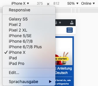
Usually you have a smartphone and maybe a tablet. However, if you want to check your website with different mobile devices, you will quickly reach your limits. However, there is a very simple solution for this. If you use the Google Chrome browser, you have an integrated function for this.
You can display your “responsive web design” for many different end devices. To do this, right-click and select “Inspect” from the menu that appears. A console opens and you can select mobile devices (see screenshot). The browser will then show you how your website is displayed on certain devices.
Tips: Optimise WordPress for mobile
If you use WordPress, the following tips are sure to be very helpful for you. Thanks to WordPress, you can carry out many optimisations with a plugin or an internal function. This makes your work easier and saves you time:
- The basic requirement is a responsive theme. I recommend that you choose a premium theme for WordPress. Although this costs a few dollars, it gives you significantly more options. In addition, a premium theme is usually better programmed, from which you also benefit.
- If your theme needs optimisation in the mobile view, you have 2 options. Either you change the theme or you optimise your existing theme. You can use a child theme for the optimisation. Hire a programmer to implement the optimisations for you.
- There are now many theme builders with which you can easily create your desired design and optimise WordPress for mobile. Examples include Thrive Themes and Divi.
If you are new to WordPress but find it interesting, you can take a look at the following. On this page you will find a WordPress tutorial in which you will learn all the important basics about this ingenious content management system.
Use internal links in the text
Now we come to a little insider tip that is enormously powerful: Link internal subpages relevant to the topic in the text on your website. This makes it easy for your visitors to navigate through your website. This is because smartphone users in particular prefer to simply click on a link in the text instead of laboriously searching through the burger menu.
This simple optimisation creates several positive things at once:
- Internal links are a ranking factor for Google.
- Internal links make it easier for your visitors and make them feel more comfortable on your website.
- On average, your visitors will view several of your subpages, which increases the time they spend on your website. And this is another ranking factor that will have a positive effect.
Subscribe to the Raidboxes newsletter!
We share the latest WordPress insights, business tips, and more with you once a month.
Charging time for mobile devices
We’ve now talked a lot about the topic of “optimising websites for mobile devices”. There is another aspect that you should also consider: The topic of “load time optimisation”. In my opinion, this topic is particularly important for two reasons:
- The loading time of your website is a Google ranking factor.
- The longer the loading time of your website, the more visitor cancellations you will have.
This has a huge impact on mobile visitors in particular, as loading times are always slightly longer here compared to the desktop environment. Here are 3 specific tips on how you can optimise WordPress in terms of loading time for mobile devices:
New: Raidboxes AI Site Assistant
With the new Raidboxes AI Site Assistant, you can create your website in just a few steps – without any technical stress. Whether it’s a business website, store or portfolio: You enter your prompt and the AI delivers the design, structure and content. Test the new AI Site Assistant now!

1: Pictures
Images take up the largest percentage of the loading time. Accordingly, you also have the greatest leverage here. The most important thing is that you upload the images to WordPress in the exact size in which you will embed the graphic. This will already save you file size and reduce your loading time.
Furthermore, there are now gigantic tools with which you can further reduce the file size of your images fully automatically. You can set yourself whether the quality should be maintained or reduced a little. I recommend the following two WordPress plugins:
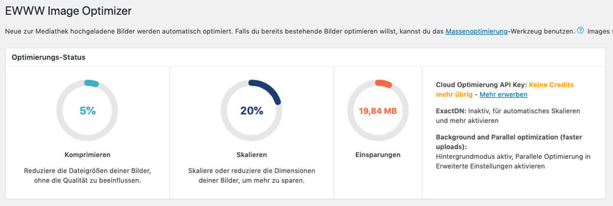
With some image optimisation plugins, you can also automatically generate WebP images. This is a completely new format from Google that further reduces the file size while maintaining the same quality.
2: Caching
The second important point concerns caching. I don’t want to go into too much detail here because you don’t need the background knowledge.
The point is that database queries are not made every time your website (or a subpage) is called up. Thanks to “caching”, a copy of each subpage is saved on your server and is therefore available much faster because no separate queries need to be made.
My plugin recommendation: WP Rocket. WP Rocket is easy to use and can be completely set up in just a few minutes. The plugin also offers further optimisations that can save additional loading time.
3: Clean out plugins and themes
Admittedly, this tip sounds very banal, and it is. Nevertheless, it is effective:
I recommend that you uninstall all plugins and themes that you are not using. Deactivating alone is not enough.
This also keeps your system clean and every additional extension carries a certain security risk. Over time, a lot of plugins and themes creep in that you don’t actually need.
On my website you will find a free video series on how to speed up WordPress. These explanations show live on screen which settings you need to make and where.
Conclusion: Is mobile optimisation worthwhile?
The internet is developing at the speed of light. There are many interesting topics and you may now be asking yourself, is mobile optimisation actually worthwhile for me? Well, of course you have to decide for yourself. However, I recommend that you optimise your website in precisely this direction:
- Optimise website for mobile devices
- Improve and optimise loading time
A website is THE figurehead that is in use for you 365 days a year. And to ensure that your flagship fulfils its purpose, it needs to be polished regularly. So my recommendation is: polish your website for mobile devices and you will certainly benefit from it.
Responsive web design – your questions
What questions do you have for Oliver? Feel free to use the comment function. For more insights on WordPress, web design or online business, follow Raidboxes on Facebook or LinkedIn – or subscribe to our newsletter.
Leave a Reply